Intro to edgeR
Table of Contents
EdgeR is a Bioconductor package designed to analyze RNA Seq data and evaluate changes in gene expression between different conditions.
Objectives
Use edgeR to examine a fly RNA Seq data set to compare a gd7 and toll10b mutant strains and determine which genes exhibit differences in gene expression.
Experiment Table
| Sample Name | genotype | replicate | File |
|---|---|---|---|
| gd7_1 | gd7 | 1 | gd7_1_ReadsPerGene.out.tab |
| gd7_2 | gd7 | 2 | gd7_2_ReadsPerGene.out.tab |
| gd7_3 | gd7 | 3 | gd7_3_ReadsPerGene.out.tab |
| toll10b_1 | toll10b | 1 | toll10b_rna_1_ReadsPerGene.out.tab |
| toll10b_2 | toll10b | 2 | toll10b_rna_2_ReadsPerGene.out.tab |
Getting started
We need two things to get started:
- Find R and make sure it has the edgeR library so we can use it to analyze our data.
- A table of read counts on genes.
The first thing is easy to take care of. R is installed on our computational servers both as a command line program, as well as an RStudio web service.
Welcome to RStudio Server
First thing is to log into RStudio on the server. We have a computer devoted exclusively to running RStudio at the following address:
| Server | Description |
|---|---|
| http://franklin.stowers.org | This is the R Server we'll be using on the internet |
| http://rstudio | This is what we would use on our intranet, or with VPN |
It's always available and always up to date. If it doesn't have something you need, you can either install your own local libraries, or make a ServiceNow request to have a library installed sitewide.
Once you log on, you should see a window that looks something like this. While you can use R locally on your own computer, using it on the server like this is also a convenient way to analyze data, and gives you easy access to your UNIX home directory.
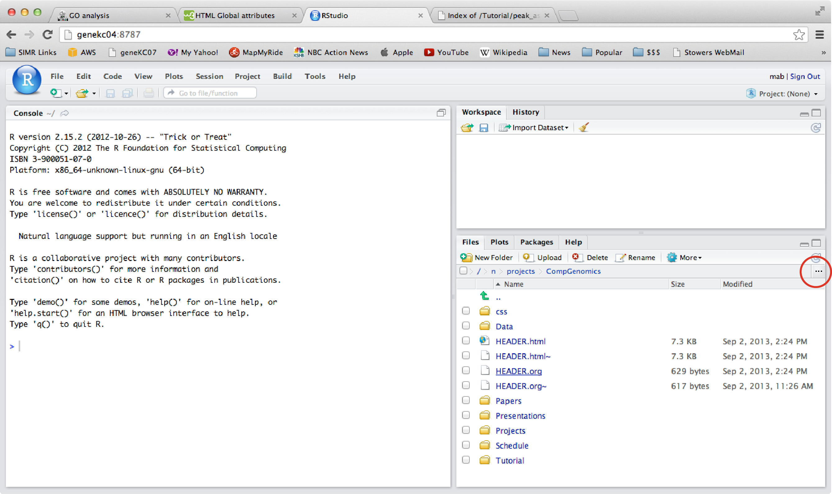
Set your working directory
When you log in to R it will open in a default location - no different than excel or any other program. You can
set what you would like to use as your working directory. This is the place where R will look for files or save files
by default. Use the functions getwd() and setwd() to get or set your working directory. Remember the place you
chose to work on your project? You should set that as your working directory.
# find out where we are
getwd()

# set where we want our working directory to be
setwd("/home/username/yourProjectName")
We can check to see what's in our working directory using the dir() command. In particular, we need to see that
our data files of interest are there.
# read the contents of the current directory
dir()
For the second problem, we have to do some R coding. We need to assemble our results into a single table of gene counts by sample.
Load data into R
There are many ways to load data into R. We will be doing something a little complicated, so let's take it a step at a time.
Loading a file into R can be done with a single line:
# read in a file
x <- read.table(file="gd7_1_ReadsPerGene.out.tab", sep="\t", header=F, as.is=T)
In the code above, R will look for that file in the current working directory. If it's elsewhere, you would have to provide the path to where the file is.
The result will be a 2 dimensional data frame, with rows and columns that we can access with square bracket notation.
Explore
Whenever you get some data, the first thing you want to do is examine it. What kinds of values are in each column?
Other goodies: dim(), tail(), nrow(), ncol(), summary()
# examine the result
head(x)

# look at a row
x[6,]

# summarize a column
summary(x[,2])
For each sample, STAR reports the following:
- column 1: gene ID
- column 2: counts for unstranded RNA-seq
- column 3: counts for the 1st read strand aligned with RNA
- column 4: counts for the 2nd read strand aligned with RNA
Build a Count Table
We'd like to read in several files, take a column from each one, and then put those columns together in a new data frame. This sounds hard, but we can break it down into steps.
- get all filenames
- create an empty data structure to hold our data
- open each file and grab a column of data
- add the column of data to our data structure
We used the dir() command to examine our directory and make sure all our .tab files were there. Now we can take advantage
of other attributes of the dir() command - in particular, the ability to specify a pattern to match.
# only return items names with a given pattern
dir(pattern="ReadsPerGene.out.tab")

# save the results to a variable
files <- dir(pattern="ReadsPerGene.out.tab")
If we have the expected list of file names, that means they are all in our current directory, and we can open them for
consolidation using a simple loop. In the code below we iterate through our files vector using a for loop.
For each value in files, we open the file, and then take a column from that file and use the cbind() function to bind it
to any other columns we've extracted previously.
counts <- c()
for( i in seq_along(files) ){
  x <- read.table(file=files[i], sep="\t", header=F, as.is=T)
  counts <- cbind(counts, x[,2])
}
Let's make sure we're getting what we expect.
# check our work
head(counts)
tail(counts)
dim(counts)
What's missing?
Since we assembled our table from pieces it has no row names or column names!
Table Properties: row and column names
We have a table of data that we can refer to systematically, i.e. counts[3,6], however, what kind of data object is it?
class(counts)
What is the difference between a matrix and a dataframe?
# what did we build our table from?
class(x)
There are two main differences. A matrix contains data of a single type (i.e. all numbers or all strings), whereas a data frame can contain data of mixed types. The second difference is that data in a dataframe can be referred to using named rows or columns. This is a powerful concept.
# we can convert from one type to another
counts <- as.data.frame(counts)
Since the gene ids are unique for each row, we could use them as "row names". Row names don't occupy a numbered column of the data, rather they become a property of the table, which can be useful later, as rows can then be referred to by name OR number. The same is true for the column names.
How do we set the row names? This is a special kind of data, and we access it in a special way using something called an accessor function. Accessor functions are used to get or set the values of certain data objects. Let's set the row names of our object.
colnames() and rownames() are accessor functions for data frames.
We know that the order of the genes in each file is the same because of the way they were generated. So we can simply set the rownames of our table from the last file we read in.
# set the row names
rownames(counts) <- x[,1]
This same thing is true for the columns. We have our column names sitting in the vector of file names we created the data table from. We simply have to assign them to our table.
# set the column names
colnames(counts) <- files
Is this better now?
head(counts)
What do you see?
There are two problems.
- The column names are large and clunky. They should be modifed to simply reflect the sample names.
- The first 4 rows of the table do not reflect gene counts but instead reflect other summary information about alignments.
We can fix both of these problems. Let's address the column names first.
Fix names
We want to fix our column names by removing the common element from each one: "_ReadsPerGene.out.tab". We've seen that we have
accessor functions that can get and set information. So let's get information, change it, and then set it. How do we change it?
There's a function we can use that does pattern substitution. It's called sub(). Look it up.
# what is sub()? How do we use it?
?sub()
We can see many useful functions in the help for sub().
# substitute the part of the names we don't want with nothing (an empty string).
sub("_ReadsPerGene.out.tab","",files)

# if our pattern replacement is working, use it to set the column names
colnames(counts) <- sub("_ReadsPerGene.out.tab","",colnames(counts))
This might look complicated, but try reading it from right to left. The stuff on the right happens first, so the old column names are used to create the new column names.
While we could rename our samples manually, it's much better to do it computationally than by hand, where mistakes might be made. Now that you're learning R, this is something you can do.
If it looks good, save a copy of the data object as a file. This can be used as a general resource in the future.
# save a copy of our data object as a general resource
save(counts, file="counts.RData")
Adjust Rows
Let's fix the rows. We can see that some of the rows are not gene names, but rather reflect different kinds of alignment counts. This is a common problem in genomic data analysis of having too much data to easily see. We can see that the first few rows have a problem, but can we easily look at all the rows? How would we know if other rows had the same problem? How do we even know how many rows we have?
Just as we did with the column names, we will use rownames() to manipulate the row name values of the table.
In this case we want to find all the rows whose names begin with a particular pattern. There's a well
known function for finding patterns called: grep(). We used this fuction in linux to find patterns in files.
grep("^N_", rownames(counts))
We use grep to find all the rownames that begin with an underscore in the name. In our pattern there's a little hat character at the beginning. This tells the function that the we want our pattern to match only if it is found at the beginning of the line.
We see that there are only a few lines with this problem.
# create an index vector to point to the rows we want to address
iv <- grep("^N_", rownames(counts))

# we can save these rows if we want
align_stats <- counts[iv,]

# and now we can remove them from our table
counts <- counts[-1*iv,]
Using a negative subscript takes the inverse of our selection, effectively removing the targeted elements. (check your work: examine the number of rows before and after).
Now we have the counts table required as the input to edgeR.
Pro Tip: For a table of results from samples like this, it's very common to create a matching table (like the one at the top of this document) that describes the samples represented by each column, and all the variables described in the experiment. In this case there's only a single variable (genotype), but more complicated experiments may have several variables and the table can be used as a resource to describe and group the samples by condition. It both communicates the experiment and can help guide the analysis. For example, here is an example table of a more complicated experiment. We can use this as a resource to re-order the data at will, rename samples, pick out specific variables, etc. This table becomes like a map, connecting pieces of information about your samples and thus your experiment.
Data Characterization
Given a table of data, the first thing you want to do with it is characterize it.
We can see how many reads we have to work with for each sample by summing the columns of our table.
R has a function for this called colSums().
colSums(counts)
How can we make the result more readable?
colSums(counts)/10^6
Excercise: Make a barplot of the results. Hint: there's a function for that barplot()
We can create some colors for our barplot to make it look nicer.
cols <- c(rep("red",3),rep("green",2))
edgeR analysis
To begin analyzing the data with edgeR we have to load the library, so we can access the functions.
library(edgeR)
Now that we have a well-formed table of counts, we can run edgeR.
Filter the data
Genes with very low read counts tend to be noisy and unreliable. So we want to filter these, as well as genes with zero reads counts, out of our analysis. This is subjective, how many reads do you trust?
# how much data do we have to begin with?
dim(counts)

# 10 read counts per sample for at least one group?
# how many genes would get filtered out??
sum(rowSums(counts) < 20)

# Create a data set by filtering out some rows
countData <- counts[rowSums(counts) > 20,]

# Could also use cpm filter
# How many genes have a sum total CPM > 1
sum(rowSums(cpm(counts)) > 1)
Correlation Among data sets
# Examine correlation among data sets
cor(countData)

# we can visualize the correlation
heatmap(cor(countData))
To begin using edgeR, we have to create a special object to hold the table of data and specify how the columns are grouped.
# create an object to hold the data
y <- DGEList(countData,  group=c(1,1,1,2,2))
Brief aside: we created the group classification by typing numbers. We want to avoid this whenever possible! We could use our trick from above, and compute the classification from the column names. No mistakes!
group <- sub("_[123]","",colnames(countData))
Examine Samples with Multi Dimensional Scaling
We can examine the relationship between samples in a way similar to Principle Coordinate Analysis, whereby
separation on a graph is indicative of gene expression changes. See ?plotMDS().
# examine relationship among samples
plotMDS(y)
We can make the figure better by adding color and expanding the plot elements.
plotMDS(y, col=cols, cex=1.5)
How would you give the plot a title?
Run edgeR
Now it's time to find differentially expressed genes. The edgeR User Guide is wonderfully informative and contains excellent explanations of the code below.
# normalize the data
y <- calcNormFactors(y)

# estimate common dispersion
y <- estimateCommonDisp(y)

# estimate tag-wise dispersion
y <- estimateTagwiseDisp(y)

# find genes differentially expressed between the two groups
et <- exactTest(y)

# get the top DE genes
topTags(et)
That's it! First things first - you have some results, explore them!
# What is et?
class(et)

# Looks complicated
# What is the structure of the object?
str(et)

# there's a clue - it contains a table
# try accessing it:
head(et$table)
Make sure to check the orientation of the ratio. It is based on a sorting of the group factor, so in the case above it is 2/1.
Explore the Results
What do you expect this data to look like? What are some of the obvious things to do?
- Count DE genes
- Adjust p-values
- Optimize DE gene set
- Make a plot
Let's make broad use of boolean math and index vectors.
We want to find significant genes. How do we phrase that?
et$table$PValue < 0.05
What happens when this statement gets evaluated by R?
### How many genes look significant?
sum(et$table$PValue < 0.05)

### Histogram of the p-values
hist(et$table$PValue)

### How many genes show 2-fold enrichment?
sum(et$table$PValue < 0.05 & et$table$logFC > 1)

### Let set an index vector to identify a sub-population
# use boolean logic to highlight genes with multiple criteria.
sig.up <- et$table$PValue < 0.05 & et$table$logFC > 1
sig.dn <- et$table$PValue < 0.05 & et$table$logFC < -1

### What does the distribution of log ratios look like?
hist(et$table$logFC)

# Where is our sub-population in this plot?
hist(et$table$logFC[sig.up], add=TRUE, col="red")

### What is the range of expression ratios?
range(et$table$logFC)

### What is the range of expression values?
range(et$table$logCPM)
Check Genes of Interest
We should always check genes in the data for which we have a prediction.
##################################################
### The flybase id for the two genes are:
### Tl  -> FBgn0262473
### gd  -> FBgn0000808
### twi -> FBgn0003900
##################################################

goi <- c(Tl="FBgn0262473",gd="FBgn0000808", twi="FBgn0003900")

iv <- match(goi, rownames(et$table))

et$table[iv,]
What does this tell us?! Look at the ratios and ask yourself if they are in the predicted orientation.
Since the countData table and the et table have the same row order we can use our index to examine the read counts for these genes:
countData[iv,]]
It tells use that edgeR puts the second term in the numerator. Thus to get the orientation we want we have to switch the order somewhere. It could be as simple as switching the numbers, or if we use the factor method, we have to create an ordered factor.
# create our object with the orientation we want
y <- DGEList(countData,  group=c(2,2,2,1,1))

# OR we could create and ordered factor
group <- sub("_[123]","",colnames(countData))
group.f <- factor(group, ordered=TRUE, levels=c("toll10b", "gd7"))
y <- DGEList(countData,  group=group.f)
Now go run that edgeR code again.
Create an MA plot
One of the first things you want to do with a result like this is visualize it with an MA plot. Both M and A are elements of the table. So Simply plot them against each other.
This is an xy plot with two of the columns of your table. M represents log2 fold change, and A represents the magnitude of of the components of the ratio (logCPM).
# create an MA plot
plot(et$table$logCPM, et$table$logFC, main="MA plot tol10b/gd7", xlab="A", ylab="M")
Ok so this plot is interesting, but what's missing? What we'd really like to do is to see where the significant genes are.
Is that hard or easy? How would you do it in excel?
We can do it by targeting the genes in our data that have certain properties, and then adding to the plot based on those properties.
Let's remember our results matrix. It's really just a spreadsheet. So let's think of ways to address it. Two ways to do this would be (1) pick out the row numbers that have a certain property, or (2) we could go over all rows one by one and put TRUE or FALSE for each row as to whether it meets a certain property.
# get all row numbers that meet a given criteria
iv <- which(et$table$PValue < 0.05)

# generate a boolean vector for a given criteria
iv <- et$table$PValue < 0.05
The difference between these is that one is just a list of numbers, but the boolean solution is more general because it a boolean vector with the same dimension as the number of rows of our matrix, which means we can do boolean operations in case we want to combine several criteria. And we've already done this above, to get significant up and down genes.
What does one do with an index vector? You index something.
# highlight DE genes in orange
points(et$table$logCPM[iv], et$table$logFC[iv], col="orange")
Anyone see something wrong with this picture? Answer: it has too many significant things.
We have some data, we've looked at it, we've summarized it, but let's compare our results with what edgeR told us were the top results:
head(et$table)
topTags(et)
The topTags() function shows us an extra value that isn't there in the primary results. It's called the
False Discovery Rate (FDR). To make sense of our data we have to calculate this for all of our genes. It's easy.
Adjust P-Values
Most scientific experiments are designed around testing a single hypothesis, such as: Does this gene change under condition X? Get that? Each gene is a hypothesis. Which is why we calculate a p-value for each gene. In genomic experiments we are measuring thousands of genes - thus we are doing thousand of experiments, or actually testing thousands of hypotheses with each experiment. When we do this, we have to adjust our p-values for multiple hypothesis testing for them to be more meaningful.
Explanation. Remember the interpretation of the p-value: at a p-value of 0.05 you are saying essentially that condition X affects our gene, and our chance of being wrong is 1 in 20. That is, under the null hypothesis (condtion X has no effect on our gene), if we did 20 experiments, 1 of them would show a value equal to or larger than the one we measured in our experiment, just by chance.
Another way to say this, is that simply by chance, 1 in every 20 experiments is likely to show a positive result (i.e. a "discovery"). In genomics we test thousands of genes (hyotheses), thus under a p-value of 0.05 we can expect a false positive result for every 20 genes we measure. If we measure 6000 genes and use a p-value threshold of 0.05, that would give us 300 significant genes apparing to change significantly just by chance. These are called False Positives, and to cope with this phenomena we use something called the False Discovery Rate (FDR), also called the multiple hypothesis adjustment. You may have heard the term "Bonferonni correction", and this is one way to adjust p-values - you simply multiply the p-values by the number of experiments you've done. A p-value of 0.000001 will still be significant after you multiply it by 6000. However this kind of "correction" is considered extreme, and there's a method called Benjamini-Hochberg that is commonly used in genomics.
To correct our p-values for multiple hypothesis testing, we simply hand our p-values to a function:
# adjust p-values and assign the result to our table
et$table$padj <- p.adjust(et$table$PValue, method="BH")
Now let's find out how many of our genes are signficant, even with adjusted p-values.
sum(et$table$padj < 0.01)
Let's highlight these genes in our plot.
# create index vector of DE
iv.padj <- et$table$padj < 0.01

# highlight DE on the plot
points(et$table$logCPM[iv.padj], et$table$logFC[iv.padj], col="blue")

# draw some lines on the plot
abline(h=0, col="grey")

# draw some 2-fold change lines
abline(h=c(-1,1), lty="dashed", col="grey")
Use boolean algebra to highlight genes with multiple criteria.
# identify just the genes enriched in the mutant
tol10b.enriched <- et$table$logFC > 0 & et$table$padj < 0.01
Homework
- Save a table of genes significantly affected at least 2 fold up or down sorted from high to low.
- How many genes are up 2 fold and significantly affected?
- How many genes are down 2 fold and significantly affected?
- MA plot of your new data, however, You need to
- label the x axis
- label the y axis
- Add a figure title
- Add horizontal lines (intersecting the y axis), colored in red at +1 and -1, (bonus points for making them dashed lines).
Tip: You will need to read the help for the function plot…
I will ask you to turn in your code, I expect it to be annotated with comments. Also, I will ask you to turn in your plot (save it with RStudio)
Extras
Create a Volcano Plot
A popular but related plot is called a Volcano plot. The general aim is to plot some measure of the effect size of the experiment vs. a measure of signficance, for instance fold change of the gene versus p-value.
### Volcano Plot

# you can save your plot as an image
png(file="volcano_plot.png")
plot(et$table$logFC, -10*log10(et$table$PValue), main="Volcano plot", xlab="M", ylab="-10*log(P-val)")

# highlight our DE genes
points(et$table$logFC[tol10b.enriched], -10*log10(et$table$PValue[tol10b.enriched]), col="red")

# identify genes enriched in the control
tol10b.depleted <- et$table$logFC < 0 & et$table$padj < 0.01
points(et$table$logFC[tol10b.depleted], -10*log10(et$table$PValue[tol10b.depleted]), col="green")
Saving figures to disk
You can save your figures as png, eps, pdf, tiff, jpg files.
# tell R what kind of graphic you want
png(file="volcano_plot.png")
# draw the plot (you won't see it since you're drawing it to a file)
plot(et$table$logFC, -10*log10(et$table$PValue), main="Volcano plot", xlab="M", ylab="-10*log(P-val)")
# save the plot to disk
dev.off()
If you want to save a copy of a figure you like to a file, the following is handy:
dev.copy2pdf(file="myplot.pdf")
This copies whatever graphic you see in R to a file.
Venn Diagram
Venn diagrams are used to illustrate overlaps between sets. In our case we might want to know if our DE genes share overlap with the results of a previous experiment.
There are online tools for performing Venn analysis, like Venny. R has methods for reading and writing to the clipboard, so you can move your data, such as lists of genes, beween applications (e.g. readClipboard() and writeClipboard() on a PC, or kmisc package for platform inedependent methods).
However, probably the simplest way to draw a Venn diagram is to stay within R and simply use a function written by someone else.
There is a package called gplots that contains a function for drawing Venn Diagrams, and for dividing up the lists of genes into
the overlap sets.
We simply have to give it a list of our gene sets to compare.
library(gplots)

# look at the functions with gplots
ls("package:gplots")
To compare two sets of genes
Often we want to compare conditions to see if they have a related affect on gene expression. In this case we have some gene expression data from mutant strains that have a related phenotype, and we'd like to know if that phenotype is related to a shared gene expression response.
Let's load up some data from another related experiment:
sna <- read.delim(url("http://research.stowers.org/cws/CompGenomics/Data/limma_result_table_stage7.txt"),
                   sep="\t", header=T, as.is=T)
When you get a new data set, it's helpful to explore it. We can do this quickly with R.
# what kinds of columns do we have?
head(sna)

# this looks like edgeR data
# what are the numbers of changed genes?
sum(sna$FDR.sna18 < 0.05 & sna$FC.sna18 > 0.5)
sum(sna$FDR.sna18 < 0.05 & sna$FC.sna18 < -0.5)
We want to compare the lists of genes enriched in each mutant. Our first list can be accessed using our tol10b.enriched variable.
# get a list of our potential tol10b targets
tol10b.genes <- rownames(et$table[tol10b.enriched,])

# get a list of target genes from the other experiment
iv <- sna$FDR.sna18 < 0.05 & sna$FC.sna18 < -0.5

sna.genes <- sna$FBgn[iv]
Now that we have two lists, let's explore what we can with them in R.
Is This in That?
R has a nice way of asking "is this in that"? It's called the "%in%" operator. Here's an example:
a <- c(2,9)
b <- c(1,2,3,5,6)

# are the elements of a in b?
a %in% b

# and if b was our thing of interest, we could simply reverse the two
# The result is always a boolean vector based on our query (the first thing).
Using this little operator we can build a Venn diagram.
# what genes in tol10b.enriched are down in sna mutants?
tol10b.genes %in% sna.genes

tol10b.genes[tol10b.genes %in% sna.genes]

# what is the overlap between gene sets?
sum(tol10b.genes %in% sna.genes)
Is this more or less than you would expect to overlap by chance alone? How would you figure that out?
Note: In a real overlap analysis, especially in terms of gauging significance, we would need to curate our data set further by limiting it to just the genes measured in common between experiments (our universe), and also making sure our DE gene lists are drawn from this same pool.
## how many genes were measured in common between the experiments?
sum(sna$FBgn %in% rownames(et$table))

## create our universe of genes
universe <- intersect(sna$FBgn, rownames(et$table))

# narrow down our gene sets to just those found in the universe
tol10b.set <- tol10b.genes[tol10b.genes %in% universe]
# etc.
The remainder is left as an exercise.
There are functions for Venn diagrams
Let's use the function from gplots to solve both problems: draw a Venn diagram and give us the subsets.
# how do we use venn?
?venn

# call venn
ourList <- list(tol10b=tol10b.genes, sna=sna.genes)
venn(ourList)
Sometimes we want 3 or 4 way Venn diagrams. These are possible by exending the list with other sets.
This is nice for drawing pictures, but we also want to know what genes are in each overlap class. Some functions in R return a value, but you might not see it unless you capture it in a variable. If we call our venn function, but assign it to a variable:
overlaps <- venn(ourList)
Examine the result and see what get's returned. Think of ways you might use this.
There are many options available for drawing Venn diagrams. Google R and Venn Diagram and you will find them. R also has a nice utility for loading code remotely. You've already seen this with the biocLite function and by loading all of our sample data sets via URL.
Simple Venn Function
Here is a simple Venn diagram function:
# load up a Venn diagram function from elsewhere
source("http://research.stowers.org/cws/CompGenomics/Resources/vennDia.R")

# draw a 2-way Venn diagram
qlist <- venndiagram(x=tol10b.genes, y=sna.genes, labels=c("tol10b","sna"), type=2)

# examine the result
qlist

# we can generate a graphical key
qlist <- venndiagram(x=tol10b.genes, y=sna.genes, labels=c("tol10b","sna"), type="2map")
And it works with sets of 3 or 4 as well.
##    # Create a test sample
##    x <- sample(letters, 18); y <- sample(letters, 16); z <- sample(letters, 20); w <- sample(letters, 22)
##    # Generates 4-way venn diagram as ellipses
##    qlist <- venndiagram(x=x, y=y, z=z, w=w, unique=T, title="4-Way Venn Diagram", labels=c("Sample1", "Sample2", "Sample3", "Sample4"), plot=T, lines=c(2,3,4,6), lcol=c(2,3,4,6), tcol=1, lwd=3, cex=1, type="4el")
##    # Generates 4-way venn diagram as circles
##    qlist <- venndiagram(x=x, y=y, z=z, w=w, unique=T, title="4-Way Venn Diagram", labels=c("Sample1", "Sample2", "Sample3", "Sample4"), plot=T, lines=c(2,3,4,6), lcol=c(2,3,4,6), tcol=1, lwd=3, cex=1, type="4")
##    # Generates 3-way venn diagram
##    qlist <- venndiagram(x=x, y=y, z=z, unique=T, title="3-Way Venn Diagram", labels=c("Sample1", "Sample2", "Sample3"), plot=T, lines=c(2,3,4), lcol=c(2,3,4), lwd=3, cex=1.3, type="3")
##    # Generates 2-way venn diagram
##    qlist <- venndiagram(x=x, y=y, unique=T, title="2-Way Venn Diagram", labels=c("Sample1", "Sample2"), plot=T, lines=c(2,3), lcol=c(2,3), lwd=3, cex=1.3, type="2")
##    # Returns the overlap results in different formats: 'type=1' returns a data frame with the overlap keys and 'type=2' the overlap counts.
##    olReport(qlist, missing=".", type=1)
##    # Plots 4-way ellipse mapping venn diagram
##    venndiagram(x=x, y=y, z=z, w=w, unique=T, labels=c("Sample1", "Sample2", "Sample3", "Sample4"), lines=c(2,3,4,6), lcol=c(2,3,4,6), tcol=1, lwd=3, cex=1, type="4elmap")
##    # Plots 4-way circle mapping venn diagram
##    venndiagram(x=x, y=y, z=z, w=w, unique=T, labels=c("Sample1", "Sample2", "Sample3", "Sample4"), lines=c(2,3,4,6), lcol=c(2,3,4,6), tcol=1, lwd=3, cex=1, type="4map")
##    # Plots 3-way mapping venn diagram
##    venndiagram(x=x, y=y, z=z, unique=T, labels=c("Sample1", "Sample2", "Sample3"), lines=c(2,3,4), lcol=c(2,3,4), lwd=3, cex=1.3, type="3map")
##    # Plots 2-way mapping venn diagram
##    venndiagram(x=x, y=y, unique=T, labels=c("Sample1", "Sample2"), lines=c(2,3), lcol=c(2,3), lwd=3, cex=1.3, type="2map")


# Generates 3-way venn diagram
qlist <- venndiagram(x=x, y=y, z=z, unique=T, title="3-Way Venn Diagram", labels=c("Sample1", "Sample2", "Sample3"), plot=T,
                     lines=c(2,3,4), lcol=c(2,3,4), lwd=3, cex=1.3, type="3")
# Generates 4-way venn diagram as ellipses
qlist <- venndiagram(x=x, y=y, z=z, w=w, unique=T, title="4-Way Venn Diagram", labels=c("Sample1", "Sample2", "Sample3", "Sample4"),
                     plot=T, lines=c(2,3,4,6), lcol=c(2,3,4,6), tcol=1, lwd=3, cex=1, type="4el")
Heatmaps
Heatmaps are a good way to visualize patterns in data.
R has a built in heat map function. Normally you'd like to see how genes change expression over various conditions. In this case, we simply have 3 replicates of wt and mutant samples so maybe we can gauge how well they correlate.
DE.exp.data <- countData[tol10b.enriched | tol10b.depleted,]

heatmap(DE.exp.data)
What happened? Here's a case where data types matter. We can fix it by coercing our data frame to a matrix with as.matrix(). Make it so.
We can improve the colors.
library(RColorBrewer)
hmcol <- colorRampPalette(brewer.pal(10, "RdBu"))(256)

heatmap(DE.exp.data, col=hmcol)
However, since we've already loaded the glots library, there happens to be another heatmap function in that package, that
has some nice features. It's called heatmap.2.
heatmap.2(DE.exp.data, col=hmcol)
Why does this heatmap look so different than the first one? Compare the docs:
?heatmap

?heatmap.2
The gplots library also has some good color utilities.
hm <- heatmap.2(DE.exp.data, col=bluered(75), scale="row", trace="none")
Examine what get's returned.
For the cool kids: pheatmap
The CompBio group is fond of a nice heatmap package that is relatively new, easy to use, and powerful.
# install pheatmap
biocLite("pheatmap")

# load the library
library(pheatmap)

# examine our data
hm <- pheatmap(DE.exp.data, scale="row")
Installing edgeR
If you were using R on your own computer and needed to install the edgeR library
We use R itself to install the package that it needs, and we do this using a utility we can grab from Bioconductor. Specifically, we can go to the bioconductor edgeR page and look at the instructions there on how to install it.
# grab Bioconductor install utility
source("https://bioconductor.org/biocLite.R")

# install edgeR
biocLite("edgeR")

# install gplots too, we're gonna need it later
biocLite("gplots")
Calculating RPKM
EdgeR has a function to combine the gene count data with gene lengths to create RPKM or FPKM.
# give the gene lengths
library(GenomicFeatures)
gtf_file <- "/home/cws/CompGenomics/dm6/dm6.Ens_98.gtf"
txdb <- makeTxDbFromGFF(file=gtf_file)
tx_by_gene <- transcriptsBy(txdb, 'gene')
geneLengths <- sum(width(reduce(tx_by_gene)))

# using our DGE list object from above
iv <- match(rownames(y), names(geneLengths))

fpkm <- rpkm(y, geneLengths[iv])
That's it! Analyze data for a better life.