ImageJ Tutorial.
Jay Unruh
1. Managing Memory and Plugins
Whether you like it or not, managing computer memory is an important part of all scientific image processing tasks. ImageJ manages this process in a relatively transparent fashion. This frustrates some users, but I feel that it is better to understand the memory limitations of a particular task rather than lock up the computer at some unknown point during analysis. ImageJ is written in the Java programming language, so limitations in Java apply to ImageJ. A couple of important points about memory. Firstly, Java limits 32-bit computers to around 1.5 GB of memory. If you don't know whether your computer is 32-bit or not, right click on My Computer and go to the Properties menu and look for 32-bit or 64-bit somewhere on the resulting page. If nothing is shown, the system is likely 32-bit. 64-bit systems do not have this limitation and are therefore limited by the amount of RAM the computer has. Secondly, even if you have a 64-bit machine, your computer may or may not have 64-bit Java installed. If you download ImageJ from the ImageJ or Fiji websites, you can specify which operating system you have and it will download the correct java along with it. Thirdly, Java requires you to allocate memory when you start ImageJ. That means that all commands to increase or decrease memory require you to restart ImageJ.
On almost all versions of ImageJ, the memory can be increased or decreased by running Edit>Options>Memory & Threads... and then restarting ImageJ.
Plugin installation is another thing that is both an annoyance and an advantage in ImageJ. FIJI tries to make plugin installation simple by providing a large number of plugins preinstalled and working out dependencies. Though this course will not necessarily rely heavily on my plugins, there are a few chapters that utilize these plugins. You can install them by downloading them from http:/research.stowers.imagejplugins/zipped_plugins.html. In regular ImageJ, you simply need to copy them to your ImageJ plugins folder. On windows, this is typically c:\Program Files\ImageJ\Plugins. If you run FIJI, you can run the updater through Help>Update FIJI. Once the update is completed, click the Advanced mode menu and select Manage Update Sites and select Stowers Plugins from the menu.
One final thing to mention. Plugin developers like me have been very productive. As a result there are thousands of plugins in ImageJ. It can be hard to find them all. I highly recommend using the Command Finder tool (Plugins>Utilities>Find Commands...) to find commands. In that way if a command moves to a different folder when Fiji is updated you can always find where it is.
2. Opening Images
One would think that opening images would be the simplest part of routine image analysis. Unfortunately, that is not the case. Most microscope manufacturers make a concerted effort to make their file types as difficult to open as possible and then thwart the makers of open source analysis software by continually changing formats without notice. That being said, the heroic efforts of ImageJ developers make opening of most formats go reasonably smoothly. Most images can be opened with File>Open. ImageJ will choose the best plugin for each file type and try to open it. Dragging a file or files onto the ImageJ status bar also works. If you want more control over how the file is displayed upon opening, you can use the LOCI Bioformats importer directly (File>Import>Bio-Formats). This actively maintained importer handles almost all file types and is relatively configurable. If you want drag and drop with LOCI, run Plugins>Bio-Formats>Bio-Formats Plugins Shortcut Window. Then you can drag and drop onto that window. Another LOCI feature I find useful is the hiding of the interactive window that shows up during import. That can be accessed using File>Import>Bio-Formats (Windowless).
The one scenario in which file import becomes unbearably difficult is when a file is larger than your computer memory can hold. This happens surprisingly often with modern computer limits and file acquisition sizes. Fortunately, ImageJ has methods designed to handle this scenario. The easiest option is to use virtual stacks. This can be done through the LOCI importer by checking the "Use virtual stack" option. When using this option, your image is no longer loaded into memory, but rather continually streamed from your hard drive. Note that this process is highly dependent on the speed of your hard drive, so you might experience some delays, especially if you are working from a network drive. Also note that the image is not actually fully opened, so you can't make permanent changes to it without reading it into memory. My recommendation is to either duplicate a region/channel/zslice/timepoint of interest and then make changes to the duplicated image rather than the original. Another strategy for working with large z-stack time lapses is to perform a projection along the z axis and then work with the projected image. Duplication and projection will be covered in future chapters.
One other issue associated with ImageJ file import is colors. Many multidimensional microscope formats do not store color information in a way that ImageJ can read. Since color in multidimensional microscopy is arbitrary (any channel can be colored in any way), ImageJ will then color the channels with its own scheme (red, green, blue, gray, cyan, ...). If you are unhappy with the coloring results, you can change them arbitrarily as I will show you below.
If you don't have an image of your own, please load the ImageJ sample image "Neuron" with File>Open Samples>Neuron. You will notice that this image of a cultured neuron has five color channels. You can get more information about this image by running Image>Show Info. A window will appear with information about the image. This information is known as "metadata" because it is separate from the actual image pixel data. The metadata often include information about pixel size, slice spacing, frame time, etc. The color information associated with each channel is also metadata. The loci plugin allows for the dump of all of this metadata if you check "Display metadata".
3. Adjusting Contrast
Now that we have an image open, let's start playing with contrast settings. Note that most computer programs work with "brightness" and "contrast" of an image. As we discuss these concepts, we will utilize the histogram of the intensities as shown here:
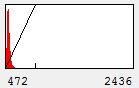
Figure 1. Contrast Histogram
On the x axis, we see the intensity values present in the image and on the y axis we see the number of pixels corresponding to each intensity value. The diagonal line across the histogram shows the visible intensity that our computer monitor displays in response to each intensity present in the image. You can bring up this histogram and its associated controls with Image>Adjust>Brightness/Contrast or ctrl+shift+c. As you can see from our first image histogram, the minimum displayed intensity is 472. As a result, all pixels with values 472 or lower are displayed as black. Our maximum displayed intensity is 2436. All pixels with that value or higher are displayed as red. In between these values the intensity increases linearly from black to red. To see what brightness means, slide the brightness control bar up and down. You will see that the position of the line moves left with higher brightness, making all of the image pixels appear brighter red. Now play with the contrast slider. As you increase contrast, bright things appear brighter and dim things go black. At the extreme, we have a black and red image.
For scientific imaging, I often want to place the lower and upper limits of my contrast at the background level and brightest intensity, respectively. As a result, brightness and contrast are a bit difficult to work with and I prefer minimum and maximum level adjustments. You can reset the image to display between maximum and minimum values by clicking the reset button. For our image you can immediately see that this is pointless:
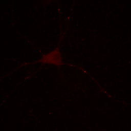
Figure 2. Neuron image with contrast set to min and max.
Our maximum intensity is set by the tiny dot in the center right in the above image and our cell appears quite dark by comparison. Our choice of display for this image depends strongly on what information we desire to communicate. If we want to show the reader the morphology of the cell and its processes, our image above fails miserably. If we are demonstrating how bright these few spots are, then the above image is perhaps appropriate.
Let's assume that we are interested in the cell and its processes. If we place our cursor over the cell body (outside the nucleus) and move it around, we can look at the raw values on the ImageJ status bar. We see that the maximum values are around 2700, so let's set the maximum value to 2800. You can either do that by adjusting the maximum slider or clicking the Set button and typing the maximum value. Here is the result:
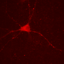
Figure 3. Neuron image with lower maximum intensity.
One must be very careful utilizing this approach. The bright puncta within the neurites are now saturated (displayed at the maximum intensity) and we no longer give the reader the ability to assess their intensity.
Now you will notice that the background is full of red haze. This is because our minimum displayed value lies below the average background value. Of course, we could set it to the actual minimum value, but that wouldn't help much because the background level is a bit noisy and we would still be significantly below most of the background. This can be visualized by looking at our histogram in Figure 1. For our neuron image, most of our pixels belong to the background. As a result, the large visible red peak at the left of the histogram is the background intensity profile. As you can see it is rather broad. We don't want to make the background completely dark (I'll explain why below), but we want it to be very close to black. A good compromise is to set the minimum value at around the middle of the background peak in the histogram like this:
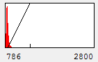

Figure 4. Histogram and neuron image adjusted for dark (but not black) background and visible cell bodies and processes.
Now our background appears quite dark and our foreground nicely shows our cell body and the neurites.
Now is a good time to discuss image processing ethics as far as contrast is concerned. For starters, it is important to let the publication reader know what we have just done in materials and methods or in the figure legend. I suggest being as detailed as possible: "Images were contrasted in ImageJ so that background levels and cell bodies were visible. Some punctate spots in the neurites were saturated to achieve cell body visibility." Now let's note some ways in which we could get ourselves in trouble with this image. For example let's say we are quantitating the levels of our protein in the neurites. If we say "protein levels at puncta in the neurites are similar to those in the cell bodies" and we present the image as in Figure 4, then we have severely misrepresented the image and committed fraud. Anyone with access to our raw images would immediately see that our statement was incorrect by adjusting the contrast upwards. Journals like JCB now check for these things by looking for saturated pixels in images. They would notice that our neurite spots are saturated and ask us for raw data or recontrasted images to prove our point.
We can also get in trouble on the low end of the intensity range. Let's say we make the following statement: "the protein is absent from the neurites except for a few punctate localizations." Of course, a careful examination of Fig. 4 shows that this is not true, but if we want to be nefarious about things, we could show the image as below:
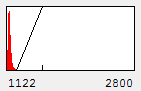

Figure 5. Image with inappropriately high minimum intensity level.
This image is the reason why we don't set our minimum display intensities so that our background is completely black. As a critical image conscious reviewer, I can look at Fig. 4 and see that the authors has not committed fraud. I and other reviewers routinely copy images out of submitted manuscripts and boost the contrast to check for such things. You can copy images out of pdfs with the pdf copy tool or Plugins>Utilities>Capture Screen. Boosting contrast can be easily done in ImageJ by dramatically reducing the maximum displayed intensity. A comparison of this operation for Figures 4 and 5 is shown below:
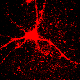
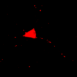
Figure 6. Images from Figs. 4 and 5 with boosted contrast.
Of course, the inappropriately contrasted image doesn't prove that the author's conclusion was incorrect or fraud was committed, simply that the images were contrasted inappropriately. A good reviewer will ask for the images to be recontrasted before making this judgment call.
What about a scenario in which one needs to show both the brightness of the puncta and the cell body? In that case, the best option is to show Fig. 2 and 4 side by side in a montage. Alternatively if only the intensity differences are important, one could show line profiles of the puncta and cell on a plot next to the image. I will show how to create a line profile later in the course.
4. Image Type and Conversion
If you look at the header immediately above our Neuron image, you will see that it is a 16-bit image. This means that each pixel of each channel contains 16-bits of intensity levels or 65536 intensity levels (2^16). This is fairly typical for scientific image acquisition systems. Other common formats are 8-bit (256 levels), 12-bit (4096 levels), 32-bit (decimal format), RGB (256 levels each for red, green, and blue), and 8-bit color (256 unique colors from a look up table). Note that 12-bit data is stored as 16-bit because the computer isn't very good at storing data types that aren't a multiple of 8.
The human eye is capable of interpreting around 100 levels of intensity. So what is the point of 65536 or even 255 intensity levels? The answer is dynamic range. If the image in Fig. 2 had been collected with only 100 intensity levels, the intensity on dim regions of the image would lie below 1 and be unusable. Our reconstrasting in Fig. 4 would lead to a grainy looking background. The higher your bit depth, the more able you are to collect both bright and dim objects in the same image.
All of this brings us to the method and purpose of image type conversion. Why should we convert our image? One reason is to be able to manipulate it without changing the data. To illustrate this, select the Neuron image and run Plugins>Utilities>Capture Image. You should now have a snapshot of the image of type RGB. Now adjust the contrast with the Brightness & Contrast window and then click back on the original image. When you go back to the snapshot, you will notice that the contrast you set has been made permanent and your new min and max intensities are now 0 and 255! Note that this will never happen with 16-bit or 32-bit images, it is unique to RGB and 8-bit images. Almost all computer programs designed to work with images do this same thing. In fact, some programs make contrast settings permanent immediately after they are changed. To illustrate the utility of 32-bit images, let's try another trick. Let's rescale our original image intensities to lie between 0 and 1 by dividing by the maximum intensity (8583). This can be done by running Process>Math>Divide. Now turn up the contrast. Our maximum pixel now has a value of 1 and all other pixels have value 0! This is because 16-bit is an integer data type. As a result, all values between 0 and 1 get changed to 0. Now reload the Neuron image and convert to 32-bit by running Image>Type>32-bit. Now perform our same division on the image and up the contrast. Everything is preserved perfectly! This is because 32-bit images hold decimal values for each pixel.
So if you want to play around with contrast settings and perform math (especially division) on images, you are always best off converting to 32-bit. So why would you ever want to work with RGB images? The answer is simple: work with RGB images when you want to perform RGB operations on an image. One example is annotation. Let's say we want to draw a white arrow on our image pointing to one of the neurites. The arrow tool can be selected from the line tool pull down menu on the ImageJ status bar. To draw it in white, make sure the ImageJ foreground color is set to white. This can be checked by looking at the dropper tool on the status bar and making sure the dropper is white. If it is not, you can change the foreground color by double clicking the dropper tool and then clicking on the white region of the grayscale bar in the window that pops up. Now draw the arrow with Edit>Draw. Finally get rid of the selection by clicking elsewhere. As you can see in the Figure below, the arrow is red, not white as we wanted. The reason for this is simple: the draw function in ImageJ simply draws objects with the same data type as the image they are drawn on. Since our image is 16-bit grayscale with a red color, the arrow was drawn in red, not white. If we want to draw something in white, we need to convert to a data type where white is defined appropriately: RGB. Perform this conversion with Image>Type>RGB Color. Now, as you can see, the color is drawn in white appropriately.
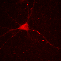
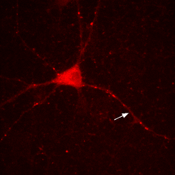
Figure 7. Annotation in 16-bit (left) or RGB (right).
Note that our RGB conversion "burned in" or made permanent all of our contrast settings. As a result, make sure you perform all contrast and arithmetic analyses before converting to RGB and creating annotations. I would also recommend making a copy of processed images before this conversion step. That way when you decide to move your arrow or change your scale bar font later on, you don't have to reprocess the image from scratch to do it.
5. Colors, Lookup Tables, Composites, and Hyperstacks
So far, everything we have done has been with a single color image. You have noticed that our neuron image has a slider at the bottom of it with a "c" next to the slider. This means that our image is a multichannel image. As you slide the slider, you can see the other colors of the image. Any image stack that is not a simple movie is called a "Hyperstack". Hyperstacks in ImageJ can contain any combination of channels, z slices, and time frames. Often we want to display overlays of different channels of an image. This can be done with Image>Color>Channels Tool or ctrl+shift+z. Changing the pull-down box at the top to Composite gives us the overlay we want. Of course, we immediately notice that this composite is rather uninformative given that all colors are completely washed out. This represents one of the major difficulties of multidimensional image display--our eyes, brains, and display monitors simply do not have enough complexity to represent all of the information in an image. In general, I have found that three channels can be reasonably represented in an image. If more channels need to be displayed, it is good to display them as a montage, possibly with a common background to orient the reader. You can toggle channels on and off with the check boxes on the Channels tool. If you want to change the contrast of a channel, select that channel with the slider under the image and then perform the contrast changes. Below are two images of our red channel with Hoechst and transmitted light as a background reference.
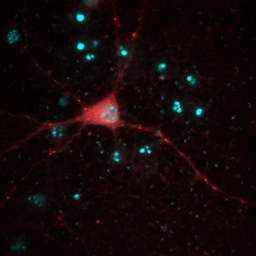
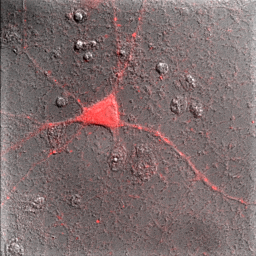
Figure 8. Composite images of the red channel with Hoechst (left) and transmitted light (right).
Immediately you will notice that features of the red channel are much more difficult to interpret with a transmitted light background than with a hoechst background. The reason for this is simple: the grayscale background has used up much of the color and intensity information in the image and leaves little for the red channel to utilize. While there is no perfect solution for this, one way to improve the image is to reduce the brightness of the transmitted light image so that it doesn't use up so much of the intensity range. To do this, you can either drag the brightness slider downwards or drag the maximum slider upwards. Note that the maximum slider can't go above the maximum value in the image. You can go above this value by clicking the Set button and typing a large value in the maximum box. As you can see by the image below, this improves the visualization of the red channel considerably.
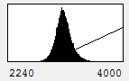
Figure 9. Gray histogram and composite image with under contrasted gray channel to maximize visual information from the red channel.
Sometimes ImageJ doesn't read the appropriate metadata for a file format and colors are incorrectly assigned to each channel. In other scenarios, you will want to recolor a channel to optimize the display for viewing or for a color-blind reader. You can change the color for a channel by selecting that channel with the slider and running Image>Lookup Tables and then selecting the appropriate color for each channel. Many color blind readers cannot distinguish red and green, so I use magenta and yellow instead as can be seen in the image below. Of course, red green is much better for those of us without mutant super-powers, so I typically only perform this operation when I know I'm presenting for a color blind reader. Of course, montages are viewable by all types of folks so those are always preferred.
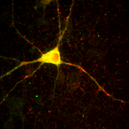
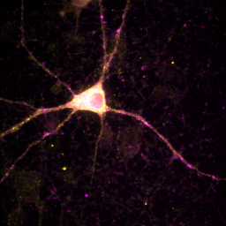
Figure 10. Typical red-green (left) and color-blind friendly magenta-yellow (right) images.
At times, you will want to emphasize a low intensity part of an image in a way that cannot be done with a single color or linear color map. The solution is to use a non-linear or multicolor lookup table with a calibration bar. For neurons especially, I like to use a logarithmic lookup table which is available at Stowers as log red, log green, log blue, and log gray. As you can see below, this display emphasizes dim regions in the image without saturating bright regions. Of course, it is extremely important to disclose this information in Figure legends or method. I also like to provide a calibration bar showing the relationship between the observed intensity and the actual intensity. This can be done with Analyze>Tools>Calibration bar. The bar is drawn on a RGB image, so I like to just crop it out and display it alongside the image and possibly with text added in illustrator. Cropping can be done by drawing a rectangle region of interest and then Image>Crop. Another, more artificial way to emphasize small intensity differences is to use a color map. The fire lookup table is widely used for this purpose as seen below.
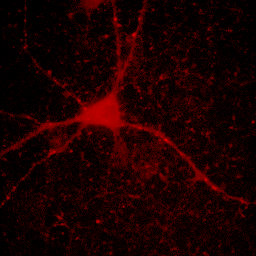
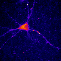
Figure 11. Illustrations of logarithmic and fire lookup tables with calibration bars.
Another issue that one often runs into is the inappropriate reading of channel and slice information or the need to combine separate images into a stack or hyperstack. If you have multiple single color images (or stacks), you can combine them into a hyperstack by using Image>Color>Merge Channels. You can combine images into a time series by using Image>Stacks>Images to Stack. If you have a big "time series" that actually contains interleaved channels and slices, you can convert it using Image>Hyperstacks>Stack to Hyperstack. There you can specify the dimension order and number of each dimension. Of course, your channels*slices*frames must be equal to the total number of frames.
6. Duplicate, Delete, Crop, and Cut/Copy/Paste
Often it is desirable to eliminate information from an image to focus on a smaller subset of the data. As I mentioned before, you can crop by selecting a region of interest and running Image>Crop or ctrl+shift+x. Cut and copy are the typical ctrl+x and ctrl+c. It is important to note that cut and copy are internal commands and do not apply to the external clipboard. This is necessary because the external system clipboard has no idea what a 32-bit image is. All images copied to the external clipboard are converted to 8-bit or RGB. Note that this action can be performed with Edit>Copy to System. Pasting from the system can use the paste command, but only if the internal clipboard is empty. Otherwise, you need to use File>New>System clipboard. Pasting from ImageJ's internal clipboard can do some very cool things. Firstly, you can paste into a channel of a multichannel image and then move the pasted region around until it is in the right place, all the while observing the overlay. Secondly, running Edit>Paste control gives you some very nice tools to perform image arithmetic. Most of these are beyond the scope of this course.
Deletion of a channel, frame, or slice in a hyperstack can be performed with Image>Stacks>Delete Slice. A dialog will ask which dimension you would like to delete. Of course, none of the proceedures I have mentioned in this section other than copy can be performed on virtual stacks. This is because virtual stack reside on the disk rather than within ImageJ. For these entities, we need to duplicate. This is done with Image>Duplicate and can be done for a region of interest (ROI) and any range of channels, slices, and frames. If you want to duplicate arbitrary lists of indices, use Image>Stacks>Tools>Make Substack.
7. Scaling and Line Profiles
I devote an entire chapter to this because scaling is the source of much consternation. This section involves some knowledge of optical resolution, so I will start with a basic introduction to that. In microscopy as in any other optical technique, the resolution is defined not only by the pixel size, but also by blurring due to the fact that light is a wave. Basically, your resolution is limited by how wide of an angle you can collect light from. This angle is related to what microscopists call numerical aperture (NA). This gets a bit complicated, but in the end, the lateral resolution is given by the following equation:

Here λ is the wavelength of light in units of microns. GFP emits around 525 nm or 0.525 μm. With a 1.4 NA objective, our resolution is then 0.23 μm. We don't know what NA objective our test image was collected with, but for now, let's assume it was acquired with a 0.8 NA air objective. Its red color suggests a red fluorophore, so we will set the emission wavelength at 600 nm, giving a resolution of 0.46 μm.
To begin our discussion of scaling, let's create a line profile perpendicular to the neurite at the brightest puncta in the red channel image. The line profile can be created by drawing a line ROI across the region. You will want to zoom in to ensure that your line crosses the maximum point. Zooming can be done with the magnifying glass tool or by putting your mouse over the region you want to zoom to and clicking the + button. The profile can then be created by running Analyze>Plot Profile or Plugins>Stowers>Jay_Unruh>Image Tools>polyline kymograph jru v1 and selecting single frame profile. I like the latter version because you can easily click the select + button to show the data points.
Figure 12. Zoomed image of a puncta and its profile.
There are a couple of interesting things to note here. Firstly let's assume that the structure underlying this bright spot is extremely small (< 50 nm). The profile and image we obtain is far larger than this. In fact, if I fit this profile to a Gaussian function, I get a width of 0.44 μm, almost exactly the resolution we predicted for a 0.8 NA objective.
Note that we get a very different sense of the quality of the image if we look at the zoomed image vs. the plot profile. Our sense of the zoomed image is defined by a single word: "pixelated." The profile, on the other hand looks perfectly reasonable. It has a well-defined profile and center peak. By my estimation, we have determined the center of the image object within approximately 2.5 nm. Quite impressive! So why do these two representations of the same data give us completely different impressions? The answer lies in how our brains interpret data points. The data points in our zoomed image are represented as squares with constant intensity. As a result, our brains focus on the edges between the pixels rather than on the spatial profile itself. I illustrate this by plotting the profile in a column plot below.
Figure 13. Column plot of the line profile from Fig. 12.
Now you see the plot as quite jagged. The reason we see the plot in Fig. 12 as much more smooth is that our eyes perform an operation called interpolation on the plot. Basically, we draw a line between the points in our minds. To remedy the pixelated nature of the image in Figure 12, we can perform a similar interpolation to what we would perform in our minds. Before we do that, we should mention that there are two common methods of interpolation. The first is simple linear interpolation. Going back to our plot profile, this method basically consists of drawing a straight line between the points. Of course, this method looks quite nice, but it our minds would draw a smoother line between the points. We should note that the line our minds would draw may not be the most appropriate one. That being said, we can draw a smooth line through the points called a cubic spline. The figure below demonstrates these methods as they relate to the line profile and the image.
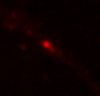
Figure 14. Top: linear and cubic interpolation of our plot profile and Bottom: bilinear and bicubic interpolation of our zoomed image region.
These images now look much better. It is important to note that though our minds draw smooth curves between points, this interpolation is not necessarily justified. While linear interpolation is obviously an oversimplification, it is the most widely accepted method of interpolation due to its simplicity and lack of artifacts. In ImageJ, interpolated scaling is accomplished with Image>Scale. If you are scaling downwards, I highly recommend selecting "Average when downsizing." Otherwise, you are simply throwing away information. For downscaling without interpolation, please use Plugins>Stowers>Jay_Unruh>Image Tools>bin image jru v1.
Despite the success of our interpolated images, you might ask, why not just collect the images at higher resolution. There are a couple of things to note here. Firstly, sampling theory says that collecting at a resolution higher than around 2.5 times our optical resolution will not give us more information. Our pixel resolution in this case was 0.16 μm, around 2.9 fold higher than our optical resolution. Secondly, by decreasing our pixel size, we reduce our number of photons per pixel by a factor of 4. This is often the difference between a high quality image and a low quality image (or the difference between high and low photobleaching). If going to small pixels means sacrificing image quality to gain nothing in resolution, I will choose bigger pixel size every time.
It is worthwhile adding a note about DPI here. DPI stands for "dots per inch" and 300 DPI is used as a minimum standard for most publications. ImageJ and most computer monitors typically display images at 72 DPI. Our zoomed image above occupies a 5 mm square at 300 DPI--here it is:
 . Obviously, this resolution is completely non-scientific and uninformative to the reader. The solution is to interpolate images to a reasonable size. I typically accomplish this through a combination of interpolation in ImageJ and interpolation in Adobe Illustrator. Interpolate for appropriate appearance in ImageJ and then rescale to 300 DPI in Illustrator. In Illustrator, use Object>Rasterize to accomplish this task. This operation performs no interpolation but will get you to the appropriate 300 DPI. It is important to point out that all images are automatically interpolated in PowerPoint.
8. 3D Viewing and Projection
Perhaps one of the most difficult tasks in microscopy visualization is the display of complex 3D data. For this chapter, we will be using the sample image, "mitosis." This is a multicolor 3D timelapse of mCherry-tubulin with GFP at the centromeres. Immediately you will notice that the colors are switched (microtubules should be red). You can use Chapter 5 to remedy this.
The simplest way to display 3D data is to perform a projection along the z axis. Of course, one loses all z dimensional information in the process. This is done with Image>Stacks>Z Project. The resulting dialog allows you to set the minimum and maximum position for the projection. This can be very useful to avoid projecting unwanted signals or background from other z planes (e.g. another cell on top of the cell of interest). The key parameter here is the projection type. Maximum projection almost always provides the greatest contrast. This is because typically the objects of interest in a 3D image are the bright ones. By contrast, the minimum intensity objects in a 3D image are often dominated by noise and background. If you want to, run the minimum projection and notice the difference. Note that this scenario is reversed for transmitted light images.
There is one important caveat to maximum (and minimum) projection. The result is statistically biased. Let's say we compare the intensities of two 3D images. They both have the same average intensity, but one is far noisier than the other. The noisier image will always appear brighter in the maximum projection because we only take the high intensity peaks in the noise. As a result, it is important to use sum or average projected images for quantitation. Sum projected images have their own caveats though. Run the sum projection on our mitosis image. Now look at the histogram in the contrast window. Our background level is 8500! This demonstrates that it is very important to appropriately subtract background when quantitating sum (or average) projections.
Now let's say we want to know how the centromeres are organized around the spindle during mitosis. Obviously, our z projection gives us no information about this. One way to visualize this is to use orthogonal views. We get these views with Image>Stacks>Orthogonal views. Now we have two windows showing us cut views through our 3D stack. Positioning the cross hairs over the spindle shows us that the centromeres are organized nicely in a ring at the beginning of the movie.
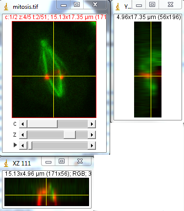
Figure 15. Orthogonal views of our mitosis movie. Note that my colors are still reversed.
As you will quickly see, it can be difficult to follow a moving object in time along the z axis with orthogonal views. For this analysis, it would be ideal to have a projection along the y axis. My plugin under Plugins>Stowers>Jay_Unruh>Image Tools>float 3d project jru v1 will do exactly that. Note that it doesn't preserve channel colors, so you will have to reset those manually. Also note that it doesn't interpolate along the z axis the way the orthogonal views did. To remedy this, you can rescale the stack in z using the Image>Scale plugin the way we did for xy scaling in Chapter 7.
Of course, the ideal 3D experience would be to generate projections at arbitrary angles. This can be done in several ways within ImageJ. I will highlight two of the plugins here. Firstly, Image>Stacks>3D Project is a powerful tool to create flying 3D rendered max projections. One caveat is that it appears not to work with bit depths greater than 8-bit or RGB. Another caveat is that it doesn't work with time-lapse data. I have a plugin under Plugins>Stowers>Jay_Unruh>Image Tools>interactive 3D viewer jru v1 that overcomes most of these issues. When running the plugin, the Z ratio parameter is simply the scaling difference between the z and xy scales. Pixels below threshold are disreguarded in the rendering and can speed up the process considerably. Number of threads is the number of multithreaded processes the plugin will use to speed up execution. Set it as high as you want, but 10 threads is typical for a normal desktop PC. The plugin will pop up a new max projected image that you can interactively rotate with the arrows on the control window. Interpolation dictates how the rendering is performed along the z axis. If you rescaled above, there is no need for this. If not, linear interpolation gives the best results, but the slowest rendering. The other options give poorer results in terms of rendering but faster performance. Changing the time axis on the original image changes it for the rendering as well. All other controls are as with any other image. The make movie button allows for the creation of a rendered movie with rotation and temporal advancement.
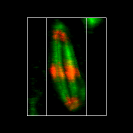
Figure 16. Maximum 3D projection of the mitosis movie with the interactive 3D viewer plugin.
By now, most people have been wowed by the impressive 3D surface renderings generated by programs like Imaris. While these tools are phenomenal, I would like to offer a word of warning to those who rely on them heavily. Surfaces are essentially thresholded images and like other thresholding processes, they omit both internal and external subtleties in images. For example, depending on the thresholding method, it may be impossible to separate the microtubules from one another. It would be a mistake to assume that the microtubules had fused simply because they threshold as one. It is always important to look at the maximum projection and even single slice data to verify the quality of the surface rendering.
9. Movie Annotation, Montage, and Export
We have already covered one of the major aspects of annotation: the importance of RGB color space for color annotations. All of the methods I will talk about in this chapter make permanent changes to images. You should therefore make sure you have all images saved before you make these changes so that you can go back if you don't like how something looks. Also make sure you have the foreground color set correctly for your annotations by double clicking the dropper tool.
Typically the first annotation I make on an image is the scale bar. This is added with Analyze>Tools>Scale Bar. I recommend hiding text and then adding the actual scale unit in the figure legend, but this is a matter of preference. For movies, I recommend labeling every slice. That way the viewer isn't at the mercy of their movie viewing software to see the scale bar on the first slice. Note that if your image wasn't imported with a scaling, you need to add it with Analyze>Set Scale. Note that ImageJ automatically interprets um as μm.
Next you will want to add time stamps. This can be done with Plugins>Stowers>Jay_Unruh>Image Tools>Time stamper jru v1. I like this plugin because it allows you to visualize the location and format of the time stamp before adding it.
Finally, I already showed how to add an arrow. To add text, select the text tool. Double clicking the text tool allows for font and size selection. Click ctrl+d to make it permanent. This only draws on one frame at a time. If you would like to draw on all frames, select Edit>Draw from the menu. It will ask if you want to draw on all frames. If you select no it still draws on the current frame, so select cancel if you don't want to draw anything.
Now that your annotations are made, you will want to make a montage for your figure. This can be a little tricky because often you want to select random frames for your montage. The solution is to write down the frames you want and use Image>Stacks>Tools>Make Substack before making your montage. Make sure you run the time stamper before you do this because it doesn't allow for random time intervals between frames. Then run Image>Stacks>Make Montage. Note that many journals now require a white border between images on montages.
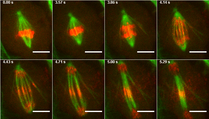
Figure 17. Montage from images 1,26,28,30,32,34,36, and 38 of the mitosis max project.
The final step in movie preparation is export for supplemental movies. Unfortunately, this is made more complex by the labyrinth of export formats and codecs that different video players use. The journals hurt things further by requiring unimaginably small sizes (< 10 MB) for supplemental movies. My recommended method may not be the best, but it is quite simple. I also highly recommend that people provide high definition copies of their movies (preferably in raw image format) via a website in conjunction with publications. To begin publication video export, save the annotated video above in avi format with no compression (File>Save As>AVI). The frame rate is up to personal preference and you can preview the frame rate with Image>Stacks>Tools>Animation options. The resulting avi file is high resolution and suitable for publication, but it is quite large (>5 MB). A file with a few more frames would be above our size limit. To further compress our file, we could always try JPEG compression, but we will lose quality. For this movie, the result isn't so bad but in my experience this is typically not the case. A more conservative option is to use quicktime compression formats. If you are running 32-bit ImageJ, you can use some of the older ones with File>Save As>Quicktime Movie. H.263 is probably the best out of these. Unfortunately, this is only available with Quicktime Pro, which isn't free but is definitely not high cost software. In my opinion it is worth the investment. In Quicktime, you can open the uncompressed avi file and run File>Export. Choose Movie to Quicktime Movie and click the Options and then Settings buttons. I like the H.264 compression type with High quality. For our movie, the resulting file is around 400 KB.
10. Quantitation: Measurements and Background Subtraction
So far, our course has focused mostly on semi-qualitative representations of data: images. In the last few years as people have become skeptical about fraud in image display and processing, the trend has gone towards quantitative representation of images. In other words, measurements. As a preliminary, let me make a few comments about reproducible acquisition practices. The easiest way quantitatively compare intensities is to compare within a single image (e.g. cell A is 1.42 times brighter than cell B). Of course, most of the time cell A and cell B can't be mixed together and one needs to acquire the images separately. In that case, you should try to acquire the images immediately after each other with the same gain, exposure time (or pixel dwell time), and illumination power. Never assume that illumination power is the same from day to day on a microscope. The variation can be quite dramatic! In principle, illumination power and exposure time differences can be corrected for. Exposure time typically increases linearly with observed intensity as long as the exposure time is significantly longer than the minimum time for your camera (usually around a few ms). These things can easily be checked by imaging a bright, photostable sample under different exposure or illumination settings. I routinely use colored fluorescent slides that filter companies hand out at meetings. Be careful to store them in a dark location for correction of data collected at different time points. Also be careful to avoid photobleaching. The intensity of these slides will be depth dependent, so I always measure at the maximum intensity point in z. Gain is much more difficult to correct for and best practice is to keep it constant. Pixel dwell time is often corrected for by confocal manufacturers so that should also be kept constant along with pinhole size.
A question that is often asked is about quantitative imaging of immunofluorescence (IF) samples. These samples add the complexity of epitope availability and penetration. Never compare between different primary or secondary antibodies. Of course, the antibody concentration, labeling protocol, and sample density should be identical between samples. I would recommend performing at least 5 staining replicates to control for variation in staining. No matter how carefully the imaging and labeling are done, an alternative explanation for IF intensity differences will always be epitope availability. One can easily imagine a protein conformational change that hides the epitope from the antibody. Of course, this observation can be important but is fundamentally different from concentration changes.
Fluorescent protein labeling also has its caveats. I have done many quantitation analyses in yeast where endogenous tagging is possible. In other systems, it is extremely important to account for relative promoter efficiency, transfection efficiency, and competition with endogenous protein. A final consideration is protein folding time. For newly formed objects, the fluorescent intensity may lag behind protein translation. In my experience in yeast, GFP becomes fluorescent in approximately 15 minutes. mCherry can take much longer. An easy way to check for maturation kinetics is to photobleach a rapidly translated protein and watch for recovery. The rate of recovery will be the sum of the translation and maturation rates.
A final caveat to analysis is the concept of focal volume and object size. As long as you are oversampling in x, y, and z, a sum projection all the way through an object will give you an unbiased estimate of the total intensity of that object. The average intensity within an object can be more difficult to obtain for small objects. To compare the average intensity between objects, one needs to either ensure that they are identical in size or that they are much bigger than the microscope focal volume in all three dimensions. One example is proteins that are uniform in the cytoplasm or nucleus.
Now that we have covered most of the acquisition pitfalls in quantitative imaging, let's get to processing. The first step in any image quantitation is background subtraction. Almost all acquisition systems have an intensity offset and almost all samples have background fluorescence. There are three basic strategies for background subtraction: uniform subtraction of background from an off-target region, spatial filtering of background from small bright objects, and temporal subtraction of immobile objects from moving ones.
The first method is simple. We will demonstrate it on our neuron image from before. First we convert our image to 32-bit. Background subtraction naturally results in negative background values. Those will be truncated at zero (biasing our intensity upwards) for data types other than 32-bit. First we must find a region that represents our background with no objects in any of the channels. The region doesn't need to be huge but must represent the heterogeneity in our background. Fig. 18 demonstrates this choice. To demonstrate the importance of background, let's measure the average intensity in that region for the red channel. Measurements in ImageJ are performed with Analyze>Measure. Before you run this, run Analyze>Set Measurements and make sure that Mean Gray Value is selected. For the region I selected on the red channel, the mean intensity is 719. If I wanted to, I could subtract this value from the image with Process>Math>Subtract (if you do this, make sure you remove the ROI otherwise only it will be subtracted. Of course, I would have to repeat this for all 5 channels. As an alternative, I have a plugin under Plugins>Stowers>Jay_Unruh>Detrend Tools>roi average subtract jru v1 which accomplishes this task. It will also perform the 32-bit conversion described above. The histogram after subtraction shows that our background is now squarely centered on 0.
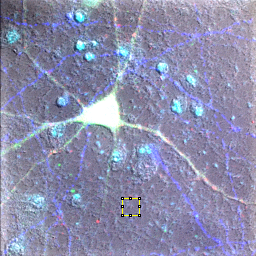
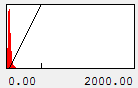
Figure 18. Neuron sample image showing background region selection and histogram after subtraction.
The second method relies on the fact that most of the important things in our image are small (neurites, cell body, nuclei...). If we were to roll a large ball over the image, its position above the image would almost be almost completely determined by the background, not our small image objects. This is the principle of the rolling ball background subtraction in ImageJ. To utilize it, run Process>Subtract Background. Again, I recommend 32-bit conversion first. The settings I utilized were a radius of 25 pixels and every box unchecked. If you have your image viewed in color or grayscale mode, you can preview the result with that box. I find it particularly informative to check the "Create background" box. That way you can see what's being subtracted as you optimize the rolling ball radius. Basically, the radius needs to be similar in size to the largest objects in the image and smaller than our background variation. You will notice immediately that the "ball" is not really a ball but rather a square (see the figure below). You can change it to a ball by selecting the "sliding paraboloid" box. The resulting image will look essentially identical to the one above, but you will notice that some of the non-uniformity is gone from the transmitted light background.
Figure 19. Rolling ball background with regular (left) and sliding paraboloid (right) method.
The third method is only applicable when subtracting rapidly moving objects from relatively static background objects in a movie. It is not routinely used from quantitation, but I mention it here as it will be used more in other chapters. In the simplest methodology, we just average the entire data set and subtract it from each image. If the background is moving slowly, then we can subtract a moving average of the background. Just as with the rolling ball, our moving average period needs to be longer than the motion of our fast objects but shorter than the motion of our slow objects. You can run this analysis with Plugins>Stowers>Jay_Unruh>Detrend Tools>subtract moving average jru v2. Select subtract static average to perform the simple methodology mentioned above. You can add back the average offset if this is necessary. Note that if you don't select static average, your movie will be shortened by the period of the moving average. This is because for the first and last period/2 frames, the moving average is undefined.
Given the amount of time we have spent on preliminaries, the actual measurement is rather anticlimactic. To obtain the total intensity of an object perform a sum projection (if you have a stack), select the region around the object, and then run Analyze>Measure (or ctrl+m). Make sure integrated density is among the selected measurements. Raw integrated density is in pixel units while integrated density is multiplied by the pixel area. To measure the average intensity of a single slice, select within the uniform region and measure. For further analysis, copy the data into excel or any other software analysis program.
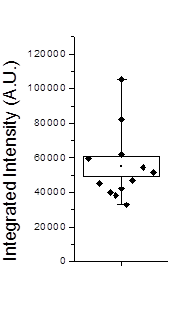
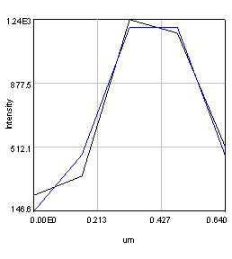
Figure 20. Left: Scatter plot of puncta intensities from the red channel of the neuron image. This plot was created in Origin Pro. Right: profile of one of the neuron image puncta (black) with a Gaussian fit (blue).
In some cases we will want to be a bit more quantitative than our simple background subtracted roi measurement. For example, perhaps we have local background that needs to be subtracted from each object. If our objects are close to the resolution of our microscope, we can fit each of them with Gaussian functions. This approach automatically corrects for the local background and provides added information about the amplitude of the peak and its width. For this approach, simply duplicate the first image of our hyperstack and select an object with a rectangle and run Plugins>Stowers>Jay_Unruh>Image Tools>fit roi gaussian gridsearch jru v1. If you select table output the fit parameters are appended to a table entitled "Gaussian Output." Note that the width of the Gaussian is given by 2.35 * stdev. The total intensity is given by 2*π*amplitude * stdev2. Note that the intensity will only relate to the integrated density measurement if your stdev is in calibrated units. Otherwise it will relate to the raw integrated density. For the fit shown in Fig. 20, the raw integrated density was 11,200 and the Gaussian fit raw integrated density was 8,200. The Gaussian fit had a baseline intensity of 107 which over the area of the fit gives and intensity 3,200. This accounts for the difference in our measurements and shows the power of the Gaussian fit approach.
11. Segmentation
Segmentation is a relatively simple concept but can be powerfully extended to complex analyses. At its most basic level, segmentation consists of setting an intensity threshold and then recognizing contiguous regions above the threshold and finally measuring those regions. Of course, we will want to eliminate regions that were wrongly connected and combine regions that were wrongly separated and then look at regions surrounding our region and then measure those regions in a separate channel, and then perform this analysis for every FDA approved compound, and you can immediately see from this run-on sentence how complex things can get. Okay--so I won't get that deep into things, but hopefully this chapter will help you make simple measurements and envision some of the possibilities. We will undertake a simple nuclear intensity measurement on the human cells sample image from the cell profiler website (http://www.cellprofiler.org/examples.shtml#HumanCells) for this example. We will segment the nuclear image and then perform measurements on the cytoplasmic and edU image. I will demonstrate the final analysis with two different methods: an internal ImageJ method and my own plugin.
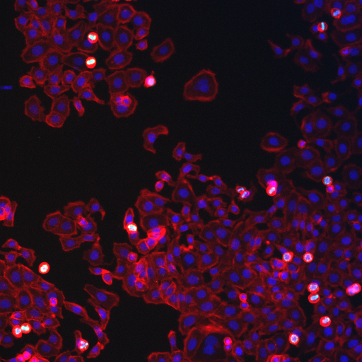
Figure 21. Human cells sample image from the Cell Profiler website.
Almost all segmentation protocols start with some sort of smoothing. This prevents separation of segmented objects because of noise. ImageJ has lots of different smoothing options but I tend to rely on image>filter>Gaussian blur. If you have a hyperstack, make sure you set the mode to color or grayscale first so you can preview the result. Usually a radius of 1-2 pixels works well. I used a radius of 1 pixel for this image.
Next you will want to threshold the image. ImageJ has many autothreshold measurements selected with Image>Adjust>Threshold. I actually prefer a simpler approach: a simple fraction of the max or mean intensity (or other statistic). The plugin to do this is plugins>Stowers>Jay_Unruh>segmentation tools>thresh 3d fraction max jru v1. If you have the threshold dialog up, the plugin will initialize with the current threshold's fractional value. A max fraction of 0.18 worked well for this image. Note that if your image has uneven illumination, you will probably need to use a rolling ball background subtraction before thresholding.
After thresholding the next step is to eliminate objects that are from noise, not the desired nuclei. These objects are typically smaller than "real" nuclei. For a typical analysis 4 pixels is a good cutoff. You will probably also want to eliminate nuclei on the edge of an image. You can perform the elimination explicitly with Plugins>Stowers>Jay_Unruh>Segmentation Tools>filter objects jru v1. If you use the ImageJ particle counter, you can simply put this constraint in that analysis later. Note that we could also use this methodology to eliminate nuclei that are clustered together in the thresholding. Instead we will attempt to separate those objects. We will do this using a simple watershed algorithm by running Process>Binary>Watershed. Note that this method is very sensitive to noise and may try to separate irregularly shaped nuclei. Nevertheless, it works well for our sample image.
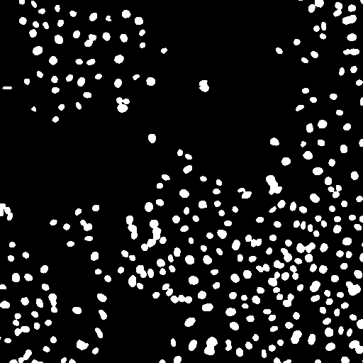
Figure 22. Object processing: from left to right, initial thresholded image, filtered to eliminate small and edge objects, and watershed processing to separate clustered nuclei.
At this point, all that is left to do is identify the nuclei and measure their intensities in the other channels. For the ImageJ-specific method, run Analyze>Analyze Particles. Of course, it would do us no good to run our measurements on the nuclear image. So the best option is to select "Add to Manager." Make sure to check "exclude on edges" if you didn't explicitly remove those nuclei earlier. Once the nuclei are added to the Roi Manager, you can apply them to the other two images by selecting those images and checking "show all" in the Roi Manager. Then click "Measure" on the Manager to list the measurements. You can then copy the measurements in to your favorite spreadsheet program for further analysis. Note that the plugins under Plugins>Stowers>Jay_Unruh>Table Tools are useful for manipulating results tables and filtering/histograming variables.
As an alternative, you can use Plugins>Stowers>Jay_Unruh>Segmentation Tools>outline objects jru v1. Note that this plugin will work with the initial smoothed image, but doesn't provide the watershed functionality. Once the plugin is run, select the edit objects option and in the dialog that opens, select Obj Stats. Then select the other channel images to perform the measurements. Note that this also works with hyperstacks. One selling feature of this method is the ability to measure the border of each nucleus. This can be extremely useful for measuring cytoplasmic intensities or subtracting autofluorescent background.
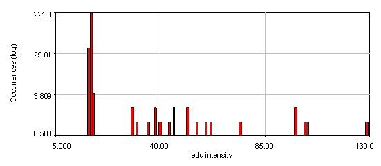
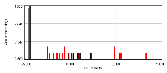
Figure 23. Intensity histograms from the human cells edu channel showing that two edu populations exist: 0 and high. The bottom histogram used a 4 pixel wide cytoplasmic region to subtract off the background for each nucleus. Note that the edu negative peak is now centered at 0. 21 nuclei out of 286 are positive for edu.
If you want to perform routine automated segmentation, I would highly recommend learning some sort of programming language. The ImageJ macro language is relatively simple to learn and can be augmented by plugins that are custom designed for specific tasks. See chapter 13 for more details on macro programming.
12. Colocalization
Colocalization is one of the most misunderstood and misused methodologies in image processing. There are several reasons for this. One is the apparent simplicity of the method. Our brains are extremely good at recognizing similarity and features within images and between images. Computers on the other hand struggle with such simple analyses. On the other hand, our brains tend to find similarity and features even in random images, so we often wonder how trustworthy this is. Our brains also struggle to normalize correctly for density differences in images. Computers are often confounded by slowly varying background that our brains immediately remove from images. Finally, we often fail to recognize the differences between compartmental colocalization and colocalization within a compartment. If you want a thorough examination of colocalization methods, Bolte and Cordelieres 2006 is a good review with an ImageJ plugin as well. I won't use their plugin here but it contains many of the same methods I will use.
There are many methods for colocalization, but I will focus on three here: objects based, correlation with randomized control, and spatial correlation. In my opinion, the latter is the most robust by far, but I am perhaps biased by my experience with spatial correlation. We will perform colocalization of the first image of our ImageJ neuron sample image.
To begin with, let's consider objects based colocalization. In this method, we will segment the image to identify green and red objects and then count how many pixels overlap. We will use our neuron image as a sample for this chapter. To begin with, let's compare colocalization of the red channel (1) with the green channel (2) to colocalization of the red channel with the blue channel (3). In the ideal circumstance, we will get significant overlap if our objects are colocalized and zero overlap if they are not. As you will know from the segmentation chapter, thresholding can be quite complex, so in our circumstance, we will keep things very simple. Just background subtract and then Gaussian smooth (Process>Filters>Gaussian Blur) with a radius of 2. I will use threshold levels of 244, 370, and 84 for the red, green, and blue images, respectively. These are obtained from the Li autothreshold, but we will not apply them in our case. If you want to apply them for visualization, feel free. This can be quite informative. To perform our analysis, run Plugins>Stowers>Jay_Unruh>Image Tools>image hist2D jru v1. This will bring up a 2D histogram of all pixel intensities in our two images. You will note that there is no visible intensity in the region where most of our signal is. This is because the background pixels dominate our image. To make those signals visible, click the edit button on the histogram and reduce the maximum z intensity to something around 10. Now you immediately see four regions in the histogram corresponding to colocalized regions (diagonal), red only regions (horizontal), green only regions (vertical), and background (centered on 0,0). To see which histogram regions correspond to which image pixels, select the diagonal histogram region and run Plugins>Stowers>Jay_Unruh>Segmentation Tools>hist 2 overlay jru v1.

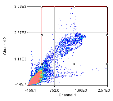
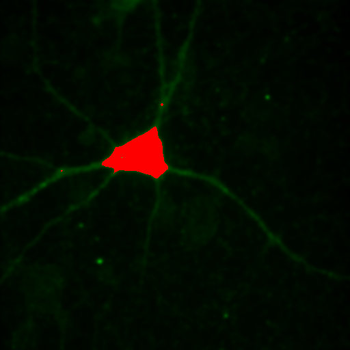
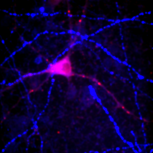
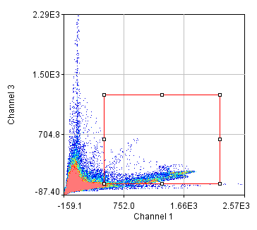
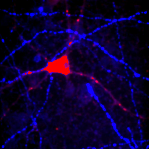
Figure 24. Top row: Overlay of the first two channels of the neuron image; 2D histogram with selected colocalized region; masked region from selected diagonal pixels in the 2D histogram. Bottom Row: identical analysis but for images 1 and 3.
This analysis immediately reveals that our most highly colocalized region is the central cell body. The "Density" label about the bottom of our 2D histogram shows that 1.5% of pixels are colocalized for this image. Similar analysis of image 1 and 3 gives us 1.4% colocalization and a very similar overlap region. Given the visual dissimilarity between images 1 and 3, we quickly learn that we must be very careful how we define colocalization. Firstly, we must be very careful to eliminate brightly colocalized regions in our analysis as they will dominate the analysis. In terms of wording, we want to "measure colocalization of neurites" rather than "measure colocalization of neurons."
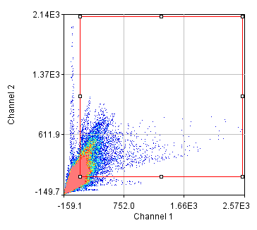
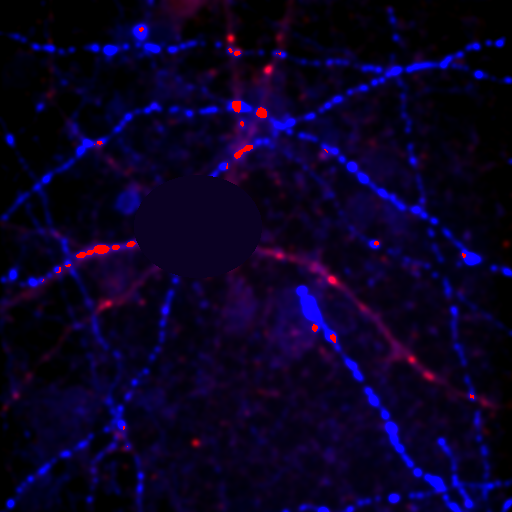
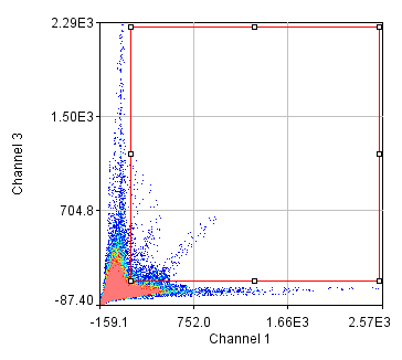
Figure 25. Repeated colocalization with the cell body set to zero for ch1 and 2 (top) and ch1 and 3 (bottom).
For our current analysis, let's select the cell body and set it to zero so that it doesn't affect our analysis. This can be done by drawing an roi around the cell body and running Plugins>Stowers>Jay_Unruh>Detrend Tools>roi outside fill avg jru v1. Check the "fill inside" box for our application. This sets the roi to the average intensity outside the roi for all images. Now, repeating the above analysis, we see that our colocalized density is 6% for the first two channels and less than 1% for channels 1 and 3. This is the fraction of pixels that are colocalized. Typically, we would prefer to know the fraction of neurite pixels that are colocalized. To perform this analysis, we click the edit button on the histogram and check "Quadrant Analysis?" a box will pop up asking for the x and y axis thresholds (these are populated with the positions of our roi origin). Finally a log window opens with the number of pixels in the four quadrants surrounding our roi origin. "Only X Over" are the number of pixels that are above background but only in Channel 1. "Both Over" are our colocalized pixels. For my analysis, I had 15600 pixels colocalized and 4000 pixels above background only in Channel 1. This gives 80% colocalization of Channel 2 objects with Channel 1 objects. On the other hand, I get 8.3% colocalization of Channel 3 objects with Channel 1 objects. This residual colocalization is mostly due to the neurite extending from the cell body leftward. Note that with the raw numbers of pixels, it is straightforward to use binomial statistics to get the error limits on these values. Please consult a statistics textbook for those details.
Next we will delve into correlation coefficients. A correlation coefficient is a measure of how strongly two variables are correlated. A coefficient of 1 indicates perfect correlation. This means that our 2D histogram will have all of its points on a thin diagonal line. It is important to note that the correlation coefficient is completely unaffected by the slope of the line as long as it is greater than 1. This makes things rather dangerous because simple bleedthrough from one channel into another gives 100% correlation! In addition, slightly uneven illumination correlates strongly between channels. As a result, it is important to eliminate bleedthrough. This can be done fairly easily on the microscope by using multi-track imaging where each excitation wavelength is only on when a specific fluorophore is being detected. As an example of the bleedthrough effect, see channel 4 of the neuron image and increase the contrast. Getting the correlation coefficient for our images is straightforward from the histograms we already have (with the zeroed cell bodies). Click the "Edit" button on the 2D histogram and select the "Pearson?" checkbox. Next draw a polygon roi that eliminates the background at 0 intensity and somewhat above in each channel. The Pearson coefficient for Channel1-Channel2 is 0.36 while it is -0.37 for Channel1-Channel3.
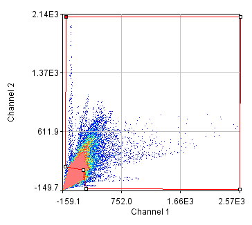
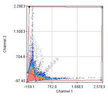
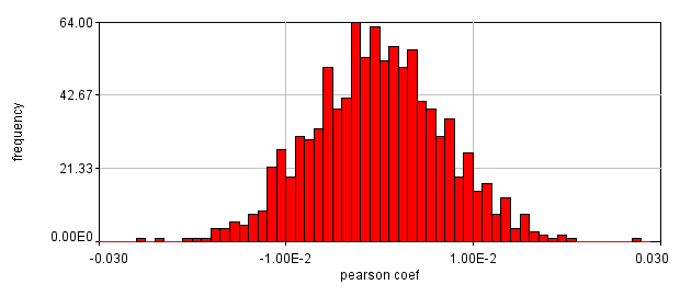
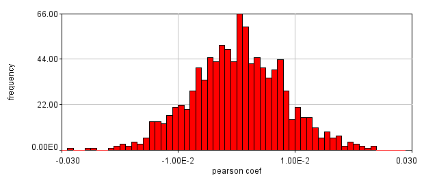
Figure 26. Roi's drawn for Pearson coefficient analysis on our two pairs of images and Coste's randomized Pearson coefficients (bottom row).
This is a rather dramatic difference. How do we know that it's significant? Let's ask this question a slightly different way. If we performed this same imaging experiment 1000 times, how often would we get these correlation coefficients by random chance? Luckily, computers allow us to do just this analysis without ever going back to the microscope. This is referred to as the Costes Method (Costes et al., 2004). We simply randomly sort one of our images randomly 1000 times and see what our correlation coefficient distribution looks like. These distributions are shown above. In 1000 random trials for either pair of images, we never achieved Pearson coefficients as high as our Ch1/2 correlation or as low as our Ch1/3 correlation. This indicates that these values are highly significant.
Despite the success of our Pearson correlation analysis above, we were still required to choose an arbitrary background cutoff. If we had not done so, our analysis would have given much lower correlation values. There is one method based on spatial correlation called the Van Steensel method (Van Steensel et al., 1996) which does not require this cutoff. Let's say we take our two images for colocalization and shift one of them by a few pixels. What would happen to our correlation coefficient? The answer depends on how small the objects are that we are trying to colocalize. In this case, we are working with very small objects, so our coefficient should drop rapidly. Objects in the background that might colocalize (like non-uniform illumination or a cropped-out cell body) will decay away much more slowly. For this analysis, we need images with only two channels in them. To generate these, use the Image>Stacks>Tools>Make Substack plugin to generate stacks with images 1,2 and images 1,3. Then run Plugins>Stowers>Jay_Unruh>ICS Tools>stack FFT iccs jru v1. Uncheck all boxes except for the Pearson box. The resulting images show the correlation coefficient for every possible shift of the two images with respect to one another. It is more informative to show the circular average with Plugins>Stowers>Jay_Unruh>Image Tools>circular avg jru v1.
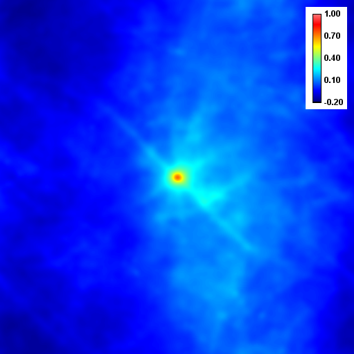
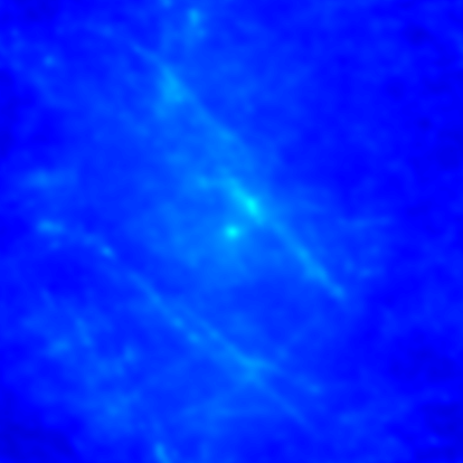
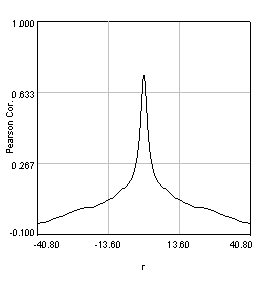
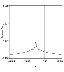
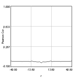
Figure 27. Pearson spatial correlation analysis of Ch1/2 and Ch1/3 and circular averages (middle row). Bottom row: correlation of Ch1 with a random particle image.
Here you can see that there is broad correlation in common between both pairs of images as well as a sharp colocalized peak corresponding to the neurites. The base of the neurite peak is around 0.13 for both images. Subtracting this from the peak value gives a correlation of 0.61 for Ch1/2 and 0.11 for Ch1/3. If we wanted to, we could fit these peaks to multiple Gaussian functions and try to deconvolve the neurite and background values. For error analysis, I recommend repeating the correlation with multiple images and measuring the error based on the height of the peak. Alternatively you can measure the error over the middle three points in the plot. To see what random correlation looks like, we can correlate Channels 1 and a randomly generated image. This image can be generated with Plugins>Stowers>Jay_Unruh>Sim Tools>simfluc scanning jru v2 with particles of standard deviation 0.6 μm. I set the same cell body region to the average as in the neuron image. As you can see, the correlation peak is completely gone, indicating that the small amount of positive correlation in the Ch1/3 analysis is significant.
So we have now successfully shown that the Channel 3 neurites are only weakly colocalized with the Channel 1 neurites while the Channel 2 neurites are strongly colocalized. But if we look closer at the first 2 channels, we see that Channel 1 is dominated by punctate structures which do not necessarily colocalize with Channel 2. Our former analysis simply asked whether or not the neurites colocalized, not whether or not the signals on the neurites are colocalized. To perform this kind of analysis, we need to do things differently. Our approach will be to create intensity profiles along the neurites and then use our spatial correlation analysis on those intensity profiles. Firstly we draw a polyline along the neurite. Then we select the polyline width to cover the neurite (this improves signal-to-noise). This is done by double clicking the polyline tool. I used a width of 4 pixels for this analysis. Then run Plugins>Stowers>Jay_Unruh>Image Tools>polyline kymograph jru v1. It is best to duplicate the first two channels before doing this. Otherwise, you can delete the unwanted profiles by selecting them (with the select + button) and then clicking edit on the plot profile and checking "Delete Selected." Once the profiles are generated, the spatial correlation curves are generated with Plugins>Stowers>Jay_Unruh>ICS Tools>traj pearson spatial cc jru v1.
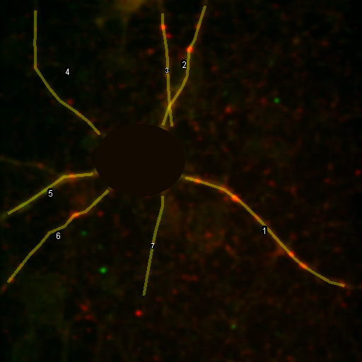
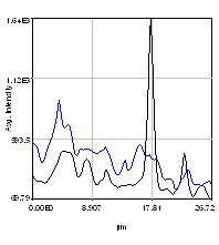
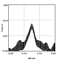
Figure 28. Neuron image with polyline roi's drawn on it, Pearson spatial correlation of one profile, and average and standard error Pearson spatial correlation for all 7 profiles.
Once the correlation curves are generated, we need to average them together. To combine them, use Plugins>Stowers>Jay_Unruh>Trajectory Tools>combine all trajectories jru v1. Now we want to average them together, but they all have different lengths (and perhaps different pixel sizes if they are from different images). Firstly, we resample the plots with Plugins>Stowers>Jay_Unruh>Trajectory Tools>resample plot jru v1. Then calculate the average and standard error with Plugins>Stowers>Jay_Unruh>Trajectory Tools>average trajectories jru v1. The average correlation curve shows definitively that there is correlation between these signals despite the fact that bright red dots are not necessarily always accompanied by bright green dots.
References:
Bolte, S.; Cordelieres, F.P. A guided tour into subcellular colocalization analysis in light microscopy. J. Microsc. 2006, 224:213-232.
Costes, S.V.; Daelemans, D.; Cho, E.H.; Dobbin, Z.; Pavlakis, G.; Lockett, S. Automatic and quantitative measurement of protein-protein colocalization in live cells. Biophys. J. 2004, 86:3993-4003.
Van Steensel, B.; van Binnendijk, E.; Hornsby, C.; van der Voort, H.; Krozowski, Z.; de Kloet, E.; van Driel, R. J. Cell Sci. 1996, 109:787-792.
13. Spectral Imaging and Unmixing
With the advent of the latest generation of spectral imaging systems spectral imaging has become a powerful tool for high sensitivity imaging in the presence of high autofluorescence. Unfortunately the commercial options for analysis have not kept pace with the hardware developments. Fortunately there are powerful open source software tools that we can take advantage of to fill this need. There are three important tools to utilize in this analysis: interactive spectral search tools, linear unmixing, and iterative blind unmixing. A typical spectral analysis starts with an exploratory set of images. For our example analysis, we have two images all collected with the same objective and dichroics. This is important given that even achromatic imaging optics do not transmit light equivalently at all wavelengths and will affect the observed spectrum. The first is a fly brain expressing high levels of Gfp. The second is a brain with Orb2 RA-EGFP on an endogenous promotor. This image is a sum projection over several z slices. These sample images can be downloaded here and here. These images are courtesy of the Kausik Si lab and are similar to those used in Majumdar et al. 2012. We start by getting the Gfp spectrum from the first image. Our system has little background so we will simply draw an roi around a high expressing region and run Plugins>Stowers>Jay_Unruh>image tools>create spectrum jru v1. Note that if your system does have background it is important to subtract it before running analysis. Note the shape of the spectrum and its peak position. If desired, save the spectrum as a .pw2 (plot object) file with the save button on the plot window.
Next, we need to do some exploration on the second image. Select three roi's and add them to the Roi Manager (press t). Then run Plugins>Stowers>Jay_Unruh>Image Tools>dynamic hs profile jru v1 keeping all of the defaults. You can move and resize the roi's and the spectrum will dynamically update. You will note that the signal is highly heterogeneous. This is unfortunate because it means that we cannot simply unmix a simple spectrum from the Gfp expressing brain. Another way to explore the signals is to perform false color projection. This creates a spectral projection of the image with different colors associated with the max or mean spectral channel at each pixel. To do this, run Plugins>Stowers>Jay_Unruh>Image Tools>float 3D depthcode jru v1. Select avg depth and c projection. Two images are outputted, a 32-bit image showing the maximum "depth" channel for each pixel. The c max depth projection image is a false colored image showing short wavelengths in blue and long wavelengths in red. Note that GFP shows up in blue here and the autofluorescence in green. This is because the plugin automatically colors from blue to red. If you want to start in the green regime, rerun the plugin with -6 set as the minimum depth and 8 set as the maximum depth. These settings just put channel 8 (570 nm) as red and channel 1 (499 nm) as slightly blue-green.
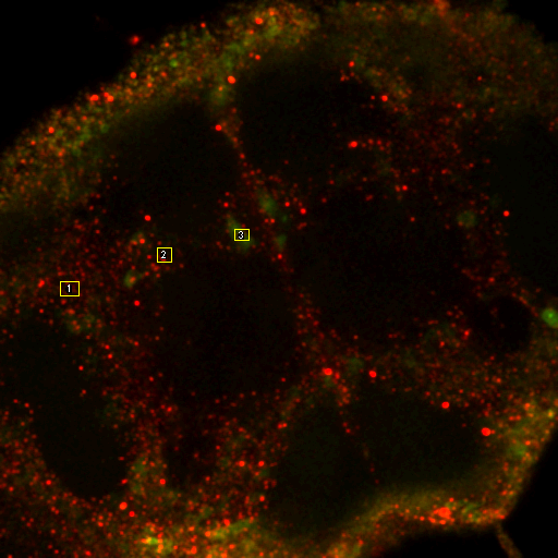
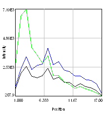
Figure 29. Left: false color brain image. Right: spectra from the roi's in the left images showing a good indication of GFP fluorescence (green) as well as two different autofluorescence spectra.
To further explore the brain autofluorescence signal, we will utilize blind unmixing tools. There are several of these available, but I really like the poison nmf tool from Neher et al. 2006. The most important feature of this algorithm is the ability to fix different spectral components and the fact that it is open source: http://www.mh-hannover.de/cellneurophys/poissonNMF/NMF/. For this tutorial, we will use my version of that algorithm. To run this plugin on the brain image, we run Plugins>Stowers>Jay_Unruh>Image Tools>nnmf spectral unmixing jru v1. You need to have the GFP spectrum loaded before running the plugin. Make sure you select the image (not the spectrum) before running the plugin. For our image we set the number of species to 3, background to 1, the saturation level to 65536, and select "Initialize from Plot" and also "Output Residuals". Then select Fix Spectrum 1. If you want, you can specify the centers and standard deviations of the initial spectral guesses, but the default values will work well. Finally select the plot window with the GFP spectrum in it.
You will need to change the colors of the unmixed image since the plugin doesn't really know what color to give each channel. You will also want to look at the residuals (the difference between the fit and the data). To do this, contrast the residuals identically to the raw spectral image (use the set button in brightness/contrast). The residuals should appear very dim relative to the original data set.
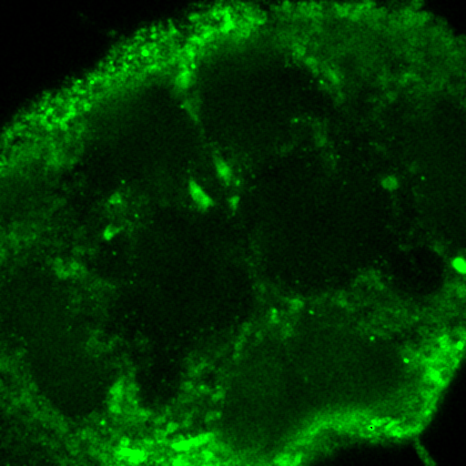
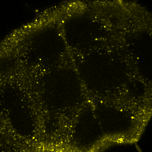
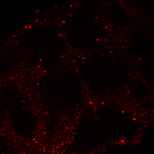
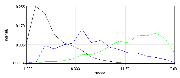
Figure 30. Top: Orb2-RA-GFP and autofluorescence unmixed images from our fly brain image. Bottom: fixed GFP and optimized autofluorescence spectra.
References:
Neher, R.A.; Mitkovski, M.; Kirchhoff, F.; Neher, E.; Theis, F.J.; Zeug, A. Blind source separation techniques for the decomposition of multiply labeled fluorescence images. Biophys. J. 2009, 96:3791-3800.
Majumdar, A.; Cesario, W.C.; White-Grindley, E.; Jiang, H.; Ren, F.; Khan, M.; Li, L.; Choi, E.M.-L.; Kannan, K.; Guo, F.; Unruh, J.; Slaughter, B.; Si, K. Critical Role of Amyloid-like Oligomers of Drosophila Orb2 in the Persistence of Memory. Cell 2012, 148:515.
14. Fluorescence Recovery After Photobleaching (FRAP)
Fluorescence recovery after photobleaching is one of the most powerful tools available to monitor protein dynamics. Frap analysis can be rather simple but can also be extremely complex ecompassing the range of reaction diffusion modeling. Simple analyses have the following workflow: registration for motion correction, background subtraction, profile measurement, and profile fitting.
The first step is both the hardest and the easiest. Of course in the ideal case cells are completely stationary in which case nothing needs to be done. In many cases registration can be done with Plugins>Registration>Stackreg. Translation and rigid body work well. I have an enhanced version (StackRegJ) that can align one channel or stack based on another. This can be useful when the fluorescent signal is insufficient for registration but the transmitted light channel is high quality. Simply select the desired registration channel before running the plugin. You can also register for example a smoothed version of your stack and use "align secondary image" to coregister the original version. In the worst case scenario, you can manually track a recognizeable landmark with Plugins>Stowers>Jay_Unruh>segmentation tools>manual track jru v1. Then register the movie with Plugins>Stowers>Jay_Unruh>segmentation tools>realign movie jru v1. Note that this plugin requires my plot window and pixel coordinates. If you have tracking data in a table use Plugins>Stowers>Jay_Unruh>table tools>plot columns jru v1 to convert the data. From excel you can copy the data and paste with text2plot jru v1.
The next step is background subtraction. This is only important if the background changes with time since our fit will give us the constant background. Follow the steps from the measurements chapter to subtract the background.
Now that we have our cell sitting still, we can perform our measurements. Select the bleach region with an roi and use Plugins>Stowers>Jay_Unruh>image tools>create spectrum jru v1 for a simple stack. For hyperstacks select the appropriate channel and slice and run dynamic hs profile jru v1. If you like, you can do multiple roi's with the roi manager (press t to add) and move them to optimize signal.
The final step is to fit the recovery. The typical for is exponential or biexponential:
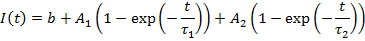
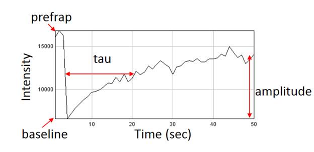
Figure 31. An example FRAP recovery curve with annotated parameters.
The fitting is most easily done with batch tools>batch frap fit jru v1. This software is called batch because it will fit all of the curves in a plot window at once. You can combine multiple open curves with traj tools>combine all trajectories jru v1. The fitting uses a logarithmic grid searching method that is both robust and accurate. You need to provide min and max tau values for the program to search between. The automatic values are usually sufficient. You can also provide a point at which to truncate the fit if there is bad data at the end of you curves. The fit will output prefrap, baseline, amplitude, and tau values as shown in the figure. Note that the t1/2 is equal to tau*0.69. Another important parameter is fraction mobile. If you bleached quantity is insignificant compared to the total cell intensity then this is given by amplitude/(prefrap-baseline). Of course if we bleached most of the cell, then we will never get back to prefrap intensities. The corrected formula for fraction mobile is amplitude/Fbleached(prefrap-baseline). Fbleached could be estimated by z stack intensity measurements before and after the FRAP measurement.
Note that if the fraction mobile is low then the tau value is poorly determined. In this case, the recovery is often dominated by a fast cytoplasmic pool.
Another very important tool for FRAP analysis is kymograph visualization and analysis. This can be particularly informative for distinguishing membrane diffusion from binding. Slaughter et al 2013 is an example of what is possible with this technique. Note that cell alignment is particularly important with this method. First draw a polyline roi around the membrane region of interest. The polyline tool is available with a right click on the line tool. Next double click the line tool to pull up the width control. Select the width to only encompass the membrane so that cytosol doesn't contribute too significantly. Then run Plugins>Stowers>Jay_Unruh>Image Tools>polyline kymograph jru v1.
Of course to fit a kymograph is a much more difficult thing. For now we will limit ourselves to simple visual comparisons to one dimensional simulations. Those can be run with Plugins>Stowers>Jay_Unruh>sim tools> sim 1d frap jru v1. Note that it is also possible to analyze the simulated data in an equivalent way to your experimental data for a more quantitative comparison.
References:
Slaughter, B.D.; Unruh, J.R.; Das, A.; Smith, S.E.; Rubinstein, B.; Li, R. Non-uniform membrane diffusion enables steady-state cell polarization via vesicular trafficking. Nat. Comm. 2013, 4:1380.