Spectral Image Analysis
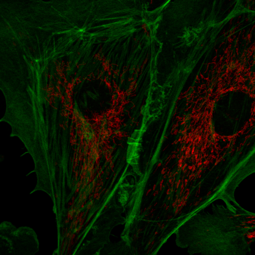
Spectral imaging is a powerful tool for a wide variety of applications including autofluorescence exploration, isolation and verification of signals weaker than autofluorescence, demultiplexing of many dye labels, and Forster resonance energy transfer (FRET). Here I will describe a number of tools we have created at Stowers for exploration and analysis of spectral imaging data in Fiji/ImageJ. Our typical workflow proceeds from interactive data exploration to spectral measurement and finally to quantitative linear unmixing. There are going to be a lot of tools here, so I am not going to list menu paths for them but rather suggest you use the Fiji command finder to find the plugins. Throughout this tutorial I will show examples with data available here: fluocells© and here: pombe. The second data set is a cropped version of Figure 5S published here: https://www.stowers.org/research/publications/libpb-1132.
Interactive data exploration:
Firstly, let me note that ImageJ is not the ideal tool for interactive spectral exploration. I provide these tools for circumstances under which accessibility to microscope manufacturer's software is not available (in all other circumstances the manufacturer's tools are superior).
Typically a spectral image is imported into ImageJ as a hyperstack with sliders for channel, z, and time if present. By default, ImageJ should set the contrast as constant for all channels if you have >6 channels in your image. This is important for being able to scroll through the stack and see the spectral trends. Sometimes this doesn't happen or you want to change the overall contrast to look at dimmer objects. The official way to do this is to adjust the contrast on one channel and then use the "Set" button on the Brightness/Contrast tool to "Propagate to the other x channels of this image". This feature also has a bug, so I have created a workaround called "set min max all chan jru v1" that performs this task.
My interactive tools typically do not work with hyperstack data, so I suggest creating projections (sum projection is recommended for spectral discovery) or duplicating time and z data points prior to interactive exploration. The most basic tool for spectral discovery is the "dynamic spectrum jru v1" tool. This tool places a region of interest (roi) on the image and shows its spectrum. As you resize and move the region, the spectrum will update dynamically:
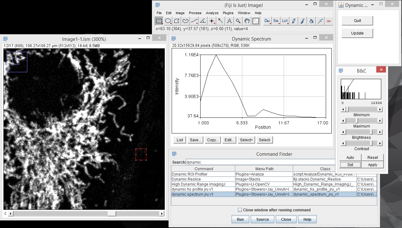
Note that because of computational burden the region of interest should be rectangular for this tool. To end the dynamic spectrum analysis, press "Quit" on the Dynamic Profile dialog.
Another tool for discovery is false coloring. Many microscope manufacturers use this sort of tool to make colorized images from spectral data. Of course, the limitation of this is that the actual spectral color may not provide the desired contrast for the human eye. For example, 620 nm and 670 nm both appear "red" but may represent Texas Red © and Cy5 ©, respectively. For false coloring, use the tool "float 3D depthcode jru v1". This tool finds the average or maximum channel for each pixel and maps it to a color map from blue to red. The plugin can also be used for z or t depth coding, so select the c projection for our application. I typically run the plugin once with default values to begin with. The plugin will output two images. One will be a false colored image (left) and the other will be a depth (or average channel) map (right).
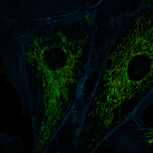
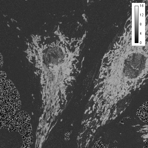
The depth (channel) map allows you to browse around the image and see what the average (or maximum) channel for each pixel was. In our image, the mitochondria have an average depth around channel 10 while the actin filaments have an average depth around channel 4. In this case, I want the actin to appear green and the mitchondria to appear red, so for the second try, I will choose a minimum depth of -3 and a maximum depth of 11. That way, channel 4 will be approximately in the middle of my spectrum (green) and channel 10 will be close to the end (red). Here is the result:
Spectral Measurement:
In many ways, spectral measurement is identical to spectral exploration, but the aim is somewhat different. The goal here is to identify pure or almost pure component spectra (or reference spectra) so that we can perform quantitative measurements later on. The easiest way to quantify spectra is simply to measure samples with only a single labelled component. In some cases, slides with pure dye or antibody or oligonucleotide probe will provide appropriate spectra. In other cases, the spectrum will be changed by the sample environment or the mounting media. The latter can be corrected for simply by mixing the label with the media. Note that it is important to measure reference spectra with the same objective and filters as your sample. These components will modify the spectrum somewhat.
In cases where one has reference samples with only one spectral component, the spectrum can be measured by drawing a region of interest on the reference image and running "create spectrum jru v1". Note that this is identical to the dynamic spectrum plugin except that it allows for non-rectangular regions of interest. I typically use the average statistic. Once spectra are collected, they can be gathered together with "combine all trajectories jru v1". Please make sure that no other plot windows are open when running this plugin as they will be included in the composite plot. Of course, you probably didn't take all of the reference samples at the same intensity, so you may want to normalize the spectra once you have them combined. This is done with "normalize trajectories jru v1". Integral normalization is considered the standard for spectral imaging (see below). Once you have your spectra combined and saved, you will probably want to save them for future analyses in ImageJ. This is done by clicking the "Save" button on the plot window and selecting the Plot Object plot type. This will save a .pw2 file that can be opened with Fiji for future reference.
Spectral Phasor
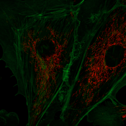
Another way to measure spectra is through the spectral phasor. Below are several references describing its development and use. The spectral phasor is based on the Fourier transform, but don't let that fool you--the underlying premise is quite simple. At its core, the Fourier transform simply consists of multiplying a curve by a cosine or sine wave and then summing up the resulting values:
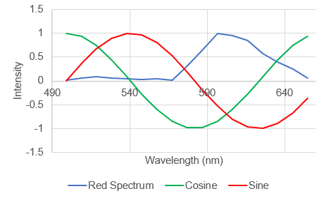
In a typical Fourier transform this is done for cosine and sin waves of ever increasing frequency to generate a complete frequency response curve. For our purposes, we will only consider the first "harmonic" as shown above. Looking at the curves above, it is apparent that the spectrum of interest overlaps the negative peak of the sin wave. As a result, its product will be strongly negative. The cosine wave has positive and negative components overlapping with the peak, so it will be less negative. By comparison, a greener spectrum will show a very different response:
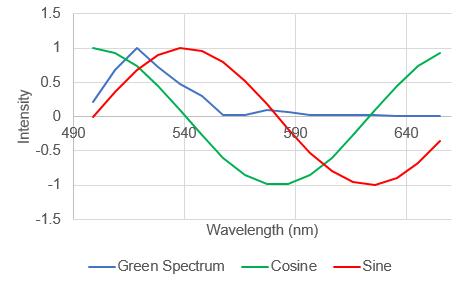
Here the spectrum overlaps with the positive part of the sine wave so the product will be positive. So we can see that the shape and position of the fluorescence spectrum determines what its Fourier products are. People refer to the cosine product as the "real" part of the Fourier transform the sine product as the "imaginary" part of the Fourier transform, but for our purposes we will call them "G" and "S" and plot them on a two dimensional plot (the phasor plot) like this:
There are mathematical rules describing where different spectra will reside on the phasor plot, but for our purposes, it is enough to know that most significant changes in spectrum will result in a unique spot on the phasor plot. The other useful characteristic of the phasor plot is that spectra containing more than one fluorophore will sit on a line between the phasor points corresponding to the fluorophores by themselves. To illustrate this, lets analyze our fluocells image with the phasor tool. Once the image is open, run "histogram 2D spectral phasor jru v1". When you first load the phasor plot, you will see something like this:
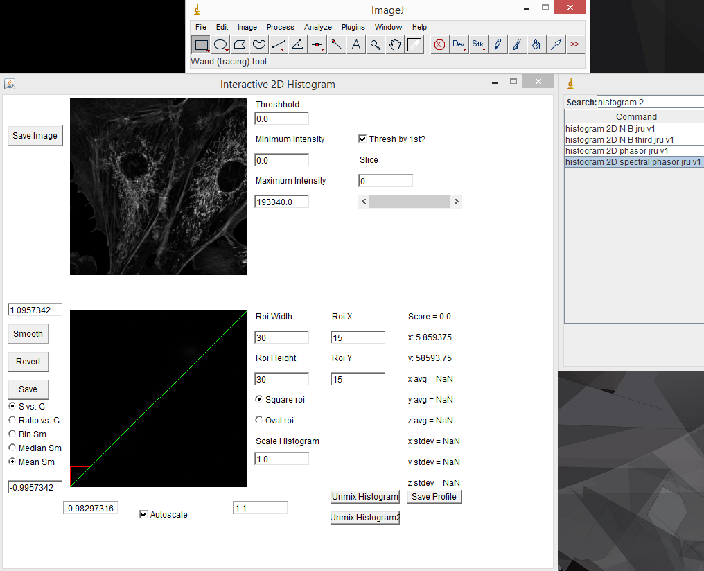
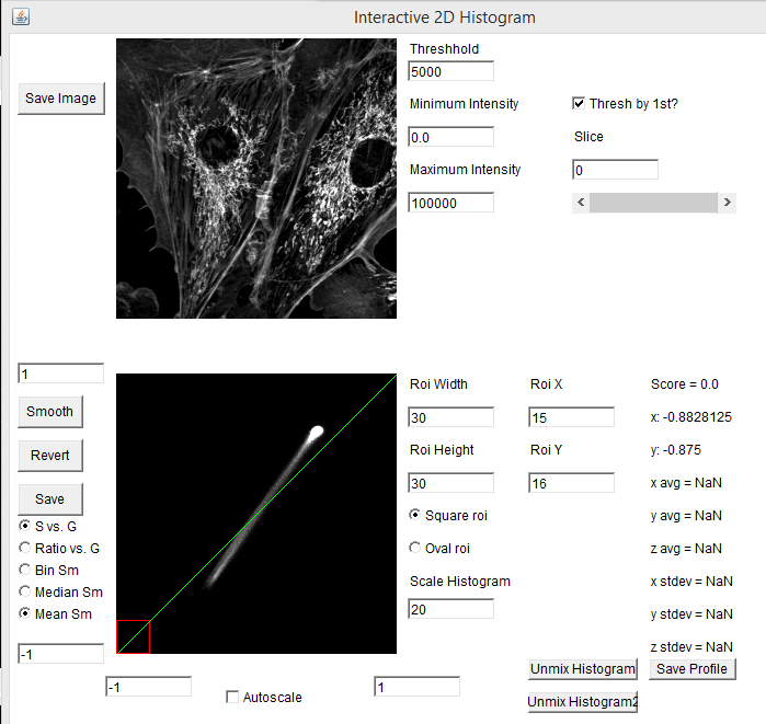
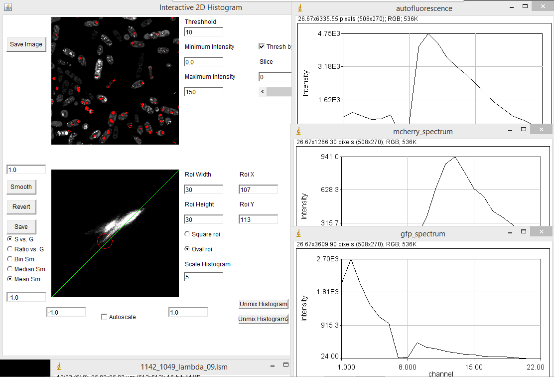
When you first load the spectral phasor plugin, there are a few things to note. The upper left image represents the spectral projection of the entire channel stack. If things are too dim to see, you need to lower the "Maximum Intensity" value. This is equivalent to lowering the maximum intensity in the brightness and contrast window in ImageJ. You must press the "Enter" key in order for changes to take place. The most important thing initially is to set the threshold. Most fluorescence images are dominated by background. This appears black in a typical image, but may represent the majority of the pixels in the image. Because these pixels are noisy, they will give nonsensical phasor values. The key is to set the threshold just below the intensity of real signals in the image. For our fluocells image, a value of 5000 seems to work well. Once you have the threshold set, you can start working with the phasor histogram at the bottom left. For spectral phasor data, I typically turn off the autoscale and set the scale from -1 to 1 on both the G and S axes. Each of the white points on this plot represent the phasor data from a single pixel in the original spectral image. It can be hard to see spectral information from small regions in the image because they don't represent a large number of pixels in the histogram. The "Scale Histogram" value multiplies the histogram by a value to be able to see these low abundance pixels. Smoothing also helps things dramatically here. You can select either Mean or Median smoothing. Subsequent presses of the Smooth button increasingly smooth the spectral data. Note that median phasor smoothing has been shown to effectively denoise the image while maintaining resolution (Cutrale et al.). Mean smoothing does sacrifice resolution but tends to smooth the phasor more effectively. The revert button resets to no smoothing. Here is a screenshot with 3 rounds of mean smoothing:
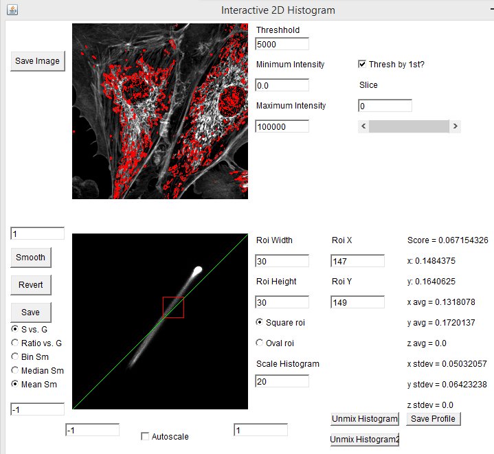
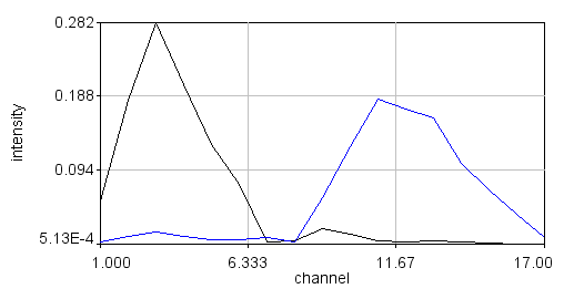
One of the powerful aspects of the spectral phasor is that one can interactively drag the roi (red square) around the phasor plot and see which phasor regions correlate with which image features. In our example, the mitochondria correspond to the lower left hand phasor point while the actin filaments correlate with the upper right hand phasor point. The midpoint between these highlights regions where the microchondria and actin filaments overlap, corresponding to mixtures of the two spectra:
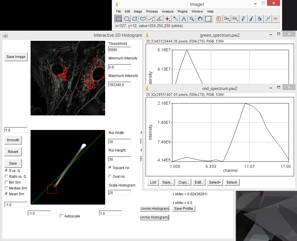
The spectral phasor tool can be used as a discovery tool, but it can also be used as a measurement tool. For example in our fluocells case, we can immediately find the pixels with pure (or close to pure) mitochondrial spectrum by selecting the lower extreme of the phasor distribution. Clicking the "Save Profile" button creates a spectrum from the selected pixels which we can use as our red reference spectrum. In the same way, selecting the upper extreme region gives us a pure actin spectrum:
For a labeled sample like our fluocells, this excercise is somewhat academic. We already knew that there were two spectra there and that they would label different cellular components. Lets try this on something more complicated. Our pombe data set is from sporulating pombe strains where different spores contain differently segregated proteins labeled with either GFP or mCherry plus background autofluorescence. This data is photon counting data, so the signal is much lower. I used a threshold of 10. Here my phasor histogram takes on a triangular shape with the upper right hand corner representing GFP, the lower left hand corner representing mCherry, and the upper left hand corner representing autofluorescence. The autofluorescence spectrum is surprisingly close to the mCherry spectrum here, but they are separated on the phasor plot and distinguishable by the fact that the mCherry emission peaks around 610 nm while the autofluorescence peaks around 580 nm. In addition, selection of the lower left hand phasor pixels tends to highlight two out of the four spores in many cells as expected from the published data:
Spectral Phasor References:
1. Fereidouni, F.; Bader, A.N.; Gerritsen, H.C. Spectral phasor analysis allows rapid and reliable unmixing of fluorescence microscopy spectral images. Optics Express. 2012. 20:12729.
2. Cutrale, F.; Salih, A.; Gratton, E. Spectral Phasor approach for fingerprinting of photo-activatable fluorescent proteins Dronpa, Kaede and KikGR. Meth. Appl. Fluoresc. 2013. 1:035001.
Non-negative matrix factorization
At this point in our tutorial, we have assumed that we either have samples containing spectral components on their own or we have unique pixels in the image that are purely one spectrum or another. In some samples, this is simply not the case. As a result, there are no regions of the phasor plot that are unique to one spectrum or another. In this case, one option for spectral discovery is blind or semi-blind unmixing. There are several different versions of this but the version I find the most reliable is non-negative matrix factorization (see the reference below). Note that these algorithms can be somewhat finicky and should be used with caution. For this example, let's assume that in our fluocells image, we are able to uniquely find the actin spectrum but not the mitochondrial spectrum. So what we want to do is fix the actin spectrum and search for the mitochondrial spectrum. The plugin I use is called PoissonNMF (available at https://github.com/neherlab/PoissonNMF) but I have created my own version of it called "nnmf spectral unmixing jru v1" for ease of use. If I run this plugin after measuring the actin spectrum, I get these initial options:

The next dialog asks for spectral initialization information. If the spectra aren't initialized from a plot, you can specify them as Gaussian peaks. You can also choose which ones to fix in the optimization process. We will fix spectrum 1 which will be initialized from our plot. The next dialog asks for the plot containing our actin spectrum. Next, a real time optimization plot is shown which allows you to watch the optimization process. Here is the result:
Note that this plugin also performs unmixing.
Poisson NMF Reference:
Neher, R.A.; Mitkovski, M.; Kirchhoff, F.; Neher, E.; Theis, F.J.; Zeug, A. Blind source separation techniques for the decomposition of multiply labeled fluorescence images. Biophys. J. 2009, 96:3791-3800.
Linear Unmixing:
Once spectra are obtained, the actual process of linear unmixing is straightforward. Simply have your spectral image open (can be a hyperstack at this point) and the plot window with your component spectra and run "linear unmixing jru v2". There are several options that you can use. It is customary to normalize spectra so that output intensities correspond to integrated signal from the fluorophore of interest. It is also customary to truncate negative values, though these can at times be useful to judge the quality of the fit. Note that you can unmix a single plot rather than an image. In this case you can output the fractions of each component in the plot and their errors (as as plot window). Note that the order of the output matches the order of your spectra in the plot window. If you are unsure of this, scroll through the plots using the Select+ button on the plot to verify the order. You can also recolor the plots using the "edit plot colors jru v1" plugin. Here is our final composite unmixed image: