FCS Theory
For details on fluorescence correlation spectroscopy, please see my FCS tutorial page.
There are a few things to add on top of what is available there in relation to cross correlation. The bleedthrough fraction is often denoted as follows:

Where Ir is the intensity of the green species in the red channel (bleedthrough) and Ig is the intensity of the green species in the green channel. Given this definition, we can define a minimum cross correlation amplitude for non-interacting species:

This value makes it possible to easily determine whether or not interaction is present in the current experiment. If the cross correlation amplitude is above the minimum value, then interaction is present.
FCS Experimental Guidelines
Most of the pitfalls in doing FCS and FCCS are related to laser power, photobleaching, or cell motion for in vivo analysis. If laser power is too high, triplet dynamics and focal volume saturation will dominate the analysis and prevent accurate determination of dynamics, concentration, and molecular brightness. It is wise to perform a power series on your sample to ensure that your settings are below the saturation level. Nevertheless, for dim molecules, it is necessary to use the highest laser power possible to achieve the best signal-to-noise.
If significant photobleaching or cell motion occurs, much of the observed dynamics will be the slow dynamics of these processes and not the molecular dynamics desired. Slow dynamics are especially disastrous for cross correlation analysis. If both the red and the green channels experience bleaching or cell dynamics, they will be strongly correlated and it will appear as though a slow pool of interacting molecules exists. The same is true for molecular brightness or concentration analysis (see the PCH website). Slow dynamics here lead to much more dramatic fluctuations and therefore an overestimation of the molecular brightness (and an underestimation of the number of particles).
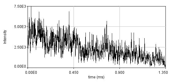
One way to combat slow dynamics is detrending. This is especially helpful when the slow dynamics are not very large. This is usually done by subtracting a moving average or fitting the trajectory to a curve that approximates the slow dynamics and subtracting that curve. Both of these methods assume that the slow dynamics present are much slower than the fast molecular motions and therefore are subtracted without changing the molecular fluctuations. Below is a simulation of bleaching. I have binned the data with 1 ms bins in order to emphasize the bleaching. Typically, we recommend that curves with variation larger than 20% be rejected, so this is an extreme case.
Below is the same data fit to a line with two segments.
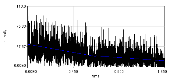
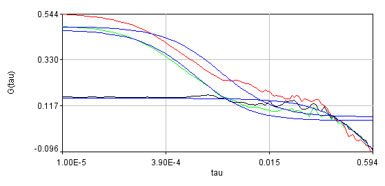
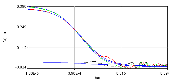
You can see that the bleaching trend is well approximated by the segmented line. Below are the correlation curves and their fits for analysis with (left) and without (right) detrending.
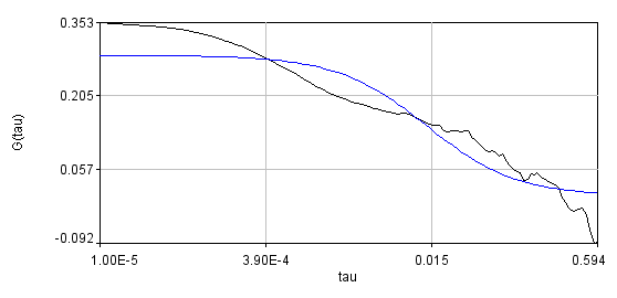
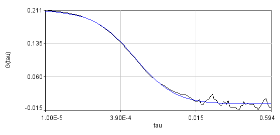
Obviously, the bleaching dynamics are hurting the analysis. The diffusion time for the non-detrended data is 14 ms, while the diffusion time for the detrended data is 0.79 ms (exactly the same as the simulation). Most telling is the molecular brightness obtained: 1,004,000 cpsm for the detrended data and 1,360,000 cpsm for the non-detrended data. Detrending is especially important for analysis of cross correlation data. Below are auto and cross correlation curves without (left) and with (right) detrending. The black line is the cross correlation. All fits are shown in blue. It is obvious that bleaching leads to high cross correlation at long time scales and that detrending eliminates the majority of this from the analysis.
Using the Plugin
Installation of the plugins requires copying the jar file into your ImageJ plugins folder. The plugins for FCS and FCCS analysis are analysis auto corr and analysis cross corr. Upon running the plugin, you will see something like the following dialog:
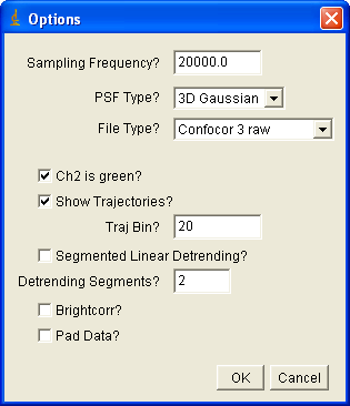
If you are importing Confocor3 or Short binary trajectory data, you must enter the sampling frequency. For PlotWindow data, the sampling frequency will be obtained from the x axis of the plot. Choose the psf type appropriate to your experiment (2D Gaussian for membrane measurements). For now, three file types are allowed: Confocor3 raw data, Short binary trajectory, and PlotWindow trajectory. The later is the appropriate selection for simulated data from my simulation plugins. A short binary trajectory is simply a 16 bit list of integers denoting the number of photons collected in each time bin. Note that all imported cross correlation data must have file names that end with _Ch#.*** where # denotes the channel number (1 or 2) and *** is any extension. For Confocor3 data, channel 2 is typically the green channel--this checkbox is selected by default. If show trajectories is selected, the trajectories will be displayed along with the correlation curves. Traj bin allows for binning of the trajectories to emphasize details (and reduce needed memory). Segmented linear detrending was described above. Brightcorr multiplies the correlation curves by the intensity so that the correlation amplitude is proportional to the molecular brightness rather than the inverse number of particles. This is useful when averaging several curves that have significantly different concentration but the same molecular brightness. Padding is used to make the data power of 2 length for the FFT used in calculating the correlation function. Note that if this is not selected, your data may be truncated by up to half of its original length.
After this dialog is closed, you will be prompted to select all files to import. Hold down control to select multiple files. You must selected both files for both channels for cross correlation data. After this dialog is closed (if everything goes well), five new windows will appear. Four of these windows are plots containing the selected correlation curve, the average correlation curve, the selected trajectory, and the average trajectory. Note that these plots are not locked for editing, so you can rescale them, etc. but make sure you do not delete data points or plots because the program will lock up. The largest window is a table of parameters:
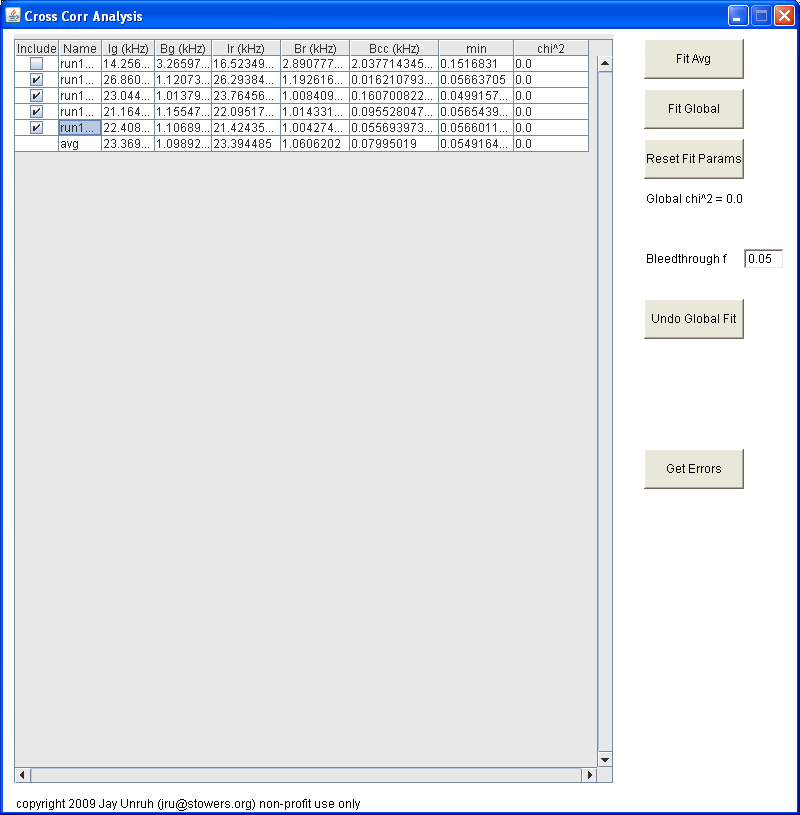
Initially, this table is populated with values from number and brightness analysis. If brightcorr was selected, all G(0) terms will be changed to brightnesses (note that this is technically the brightness multiplied by the gamma factor). Note that all units are in kHz (kcounts/sec) except for G(0) terms. On the left hand side, you can choose which curves to include in the average or global fits. On the right hand side, one can fit the avg data or fit the entire data set globally. Once the fit is complete, the main table is updated with the fit parameters rather than the number and brightness parameters. In this case, the G(0) terms are the sum of the two terms from the fit. To view the results from the fit, reopen the fit dialog by clicking the fit button again. You can then choose to refit or cancel to close the fit dialog. Within the global fit dialog one can choose complex linking patterns for the data:
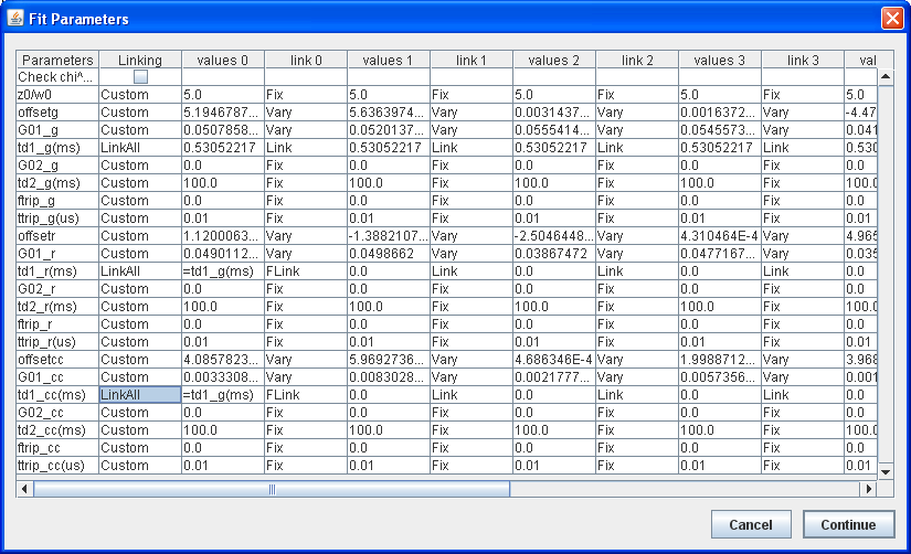
On the left, there is an overall linking parameter. Here you can selected custom to use individual links to the right, or link all, or vary all. Vary all overrides any individually fixed parameters. Link all overrides any fixed parameters other than the first column. Any linked parameters are varied in the fit as a single parameter. Note that all fits are initialized to single component by fixing the amplitude of the second component to zero. To the right of each column, one can select individual linking parameters. At the bottom of the list is FLink. This is a functional link. Here you can select relational linking to another parameter in the same column. Once this is selected, you need to put a simple formula in the cell. For example, if you want to link the diffusion times for all curves in cross correlation analysis, you would set up the pattern shown in the image above. First select LinkAll for the td1_g(ms), td1_r(ms), and td1_cc(ms) rows. Then select FLink for the leftmost columns for the td1_r(ms) and td1_cc(ms) rows. Finally enter =td1_g(ms) in both of these cells. Note that the text must be exactly the same as the row labels. You can also enter simple algebraic expressions (e.g. =0.5*td1_g(ms)+0.5*td1_r(ms)). Note that no parethesis are allowed in these formulas except for those present in the row labels.
Once the fit is complete, the global chi^2 parameter is populated as well as the individual chi^2 parameters. Note that if linking patterns are employed, the individual chi^2 terms are not true chi^2 values because the curve fits are not independent.
Errors can be obtained using the Get Errors button. The method here is the support plane errors method based on the F-test. The F-test is a simple method for comparing two different fits to see if one fit contains a significant improvement in goodness of fit. This method can be parlayed into an error estimation method by comparing fits with one parameter fixed to different values surrounding its minimum value. F is defined as the ratio between the parameter chi^2 value and its minimum value:

A limiting F value can be calculated for a specific confidence level. As the parameter of interest is forced to conform to a value different than the minimum value, the chi squared increases and F increases:
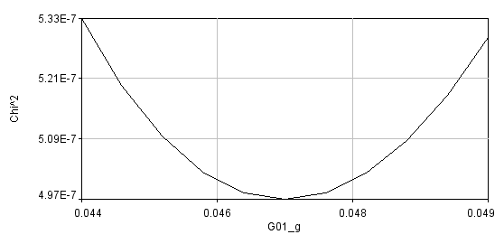
Once F reaches its limiting value, the confidence limit for that parameter has been reached.
Using the error analysis tool is straightforward. Simply select the confidence interval (percent confidence), select the parameter that you want to perform error analysis on, and select the resolution for the chi^2 plot. Note--if your resolution is too low you will not accurately estimate the parameters. If your resolution is too high, the analysis could take a very long time. For global error analysis, you must select a data series. If a parameter is linked across all data sets, any series can be selected and the error will represent the global error. Once the analysis is completed, a chi^2 plot will appear along with a log window containing the limiting F value, the chi^2 plot data points, and the upper and lower parameter limits.